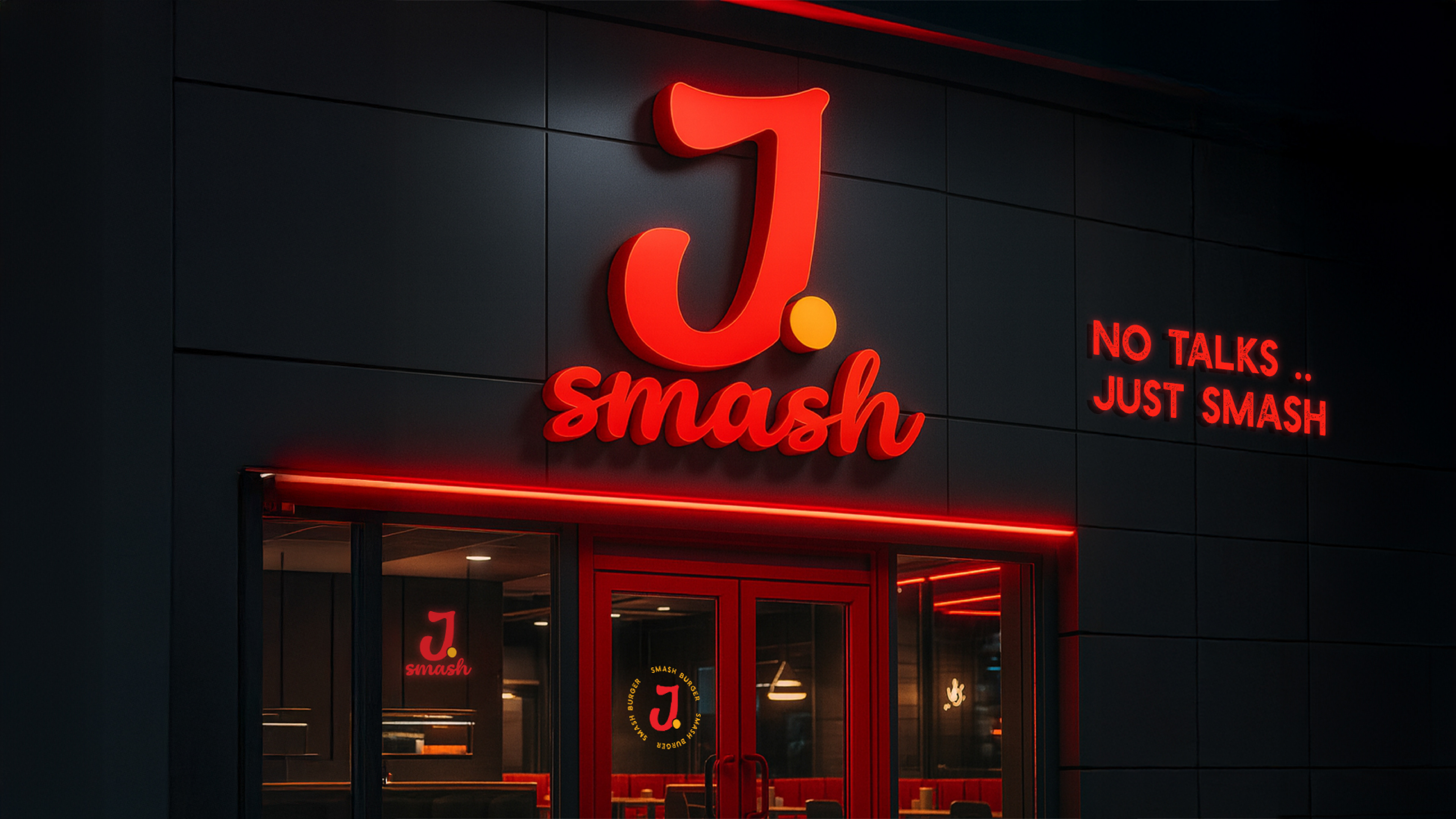
J Smash
Client: J Smash · Industry: Smash Burger Restaurant · Scope: Full Rebranding & Packaging
Client: J Smash · Industry: Smash Burger Restaurant · Scope: Full Rebranding & Packaging
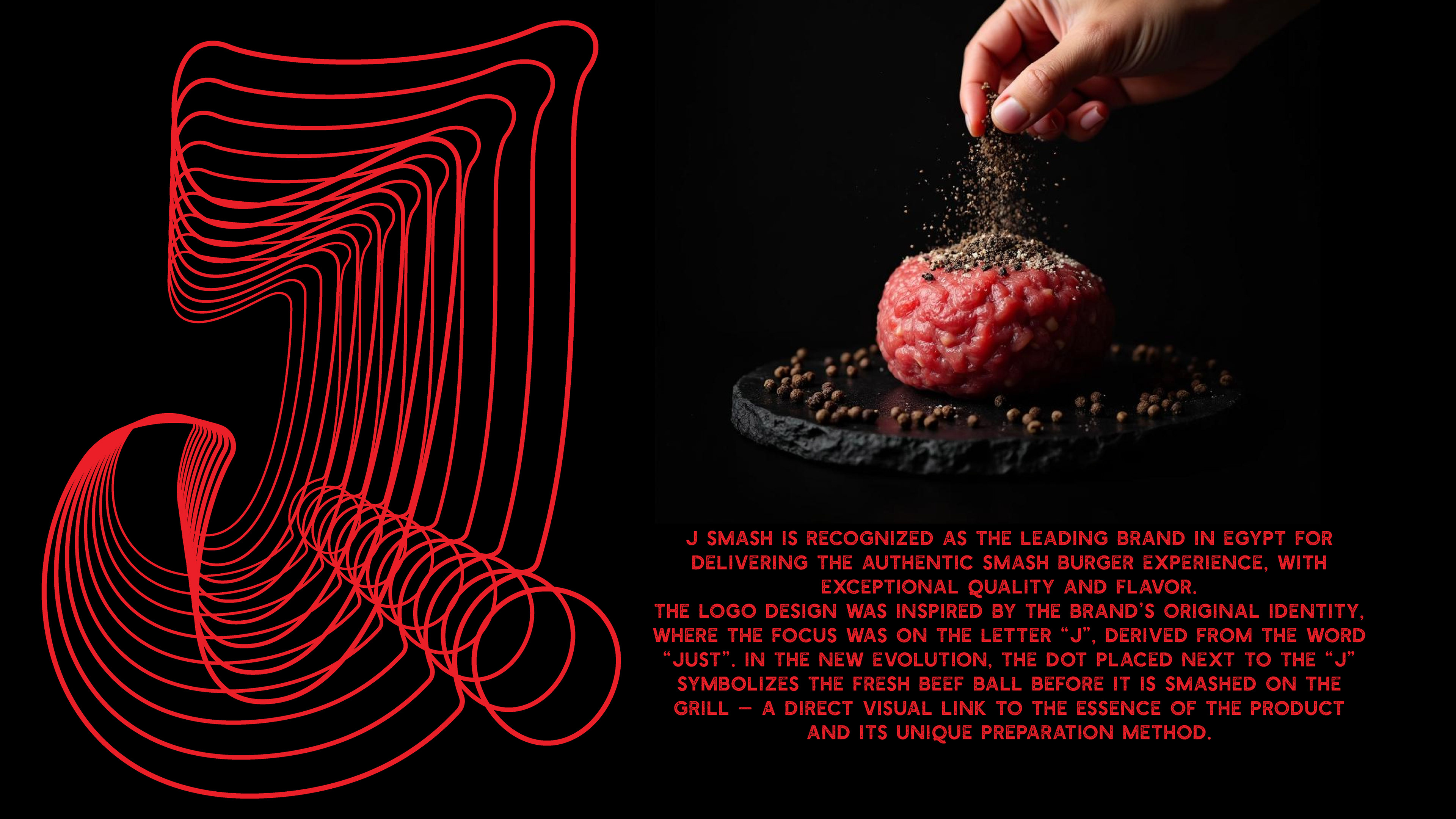
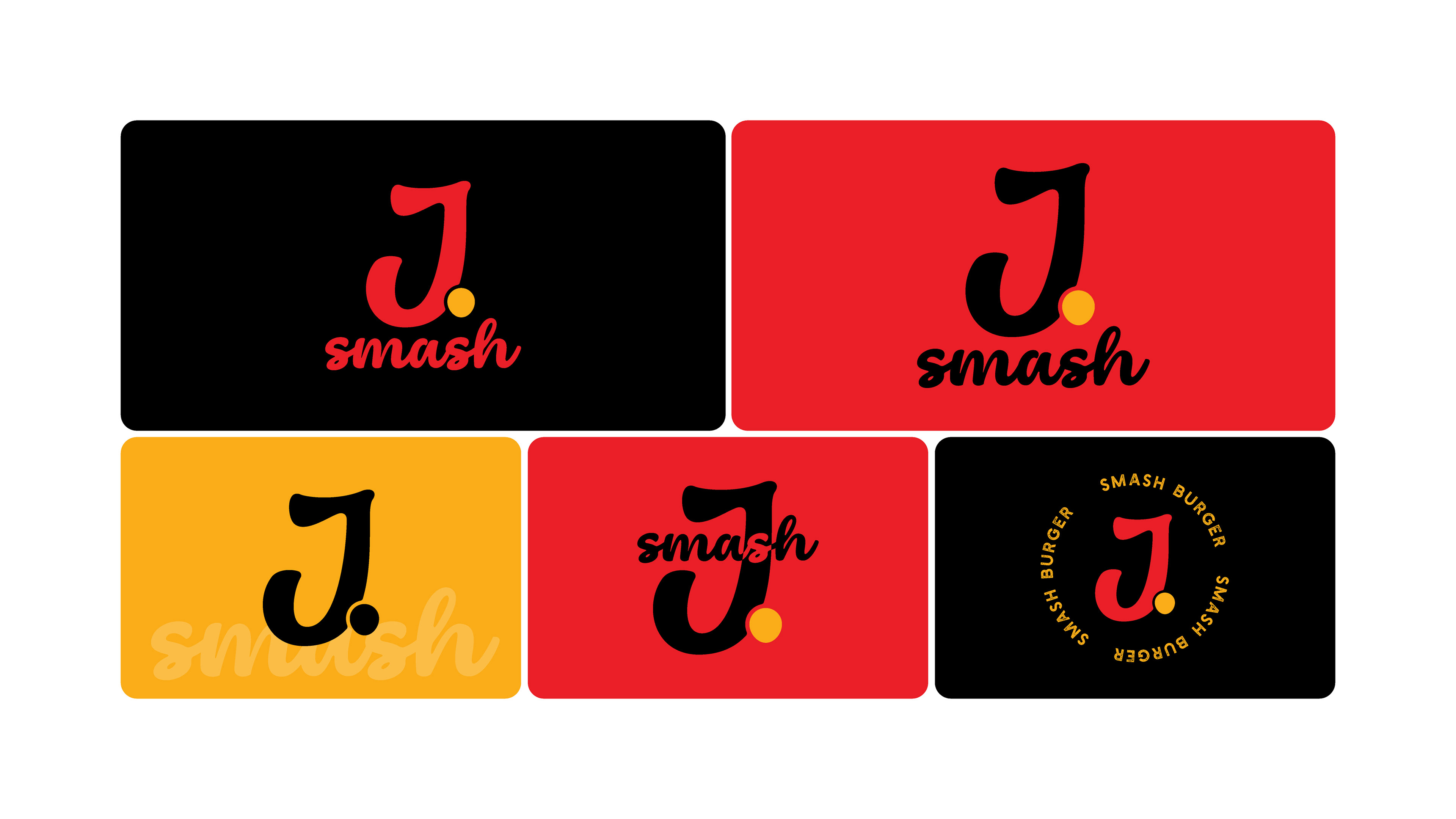
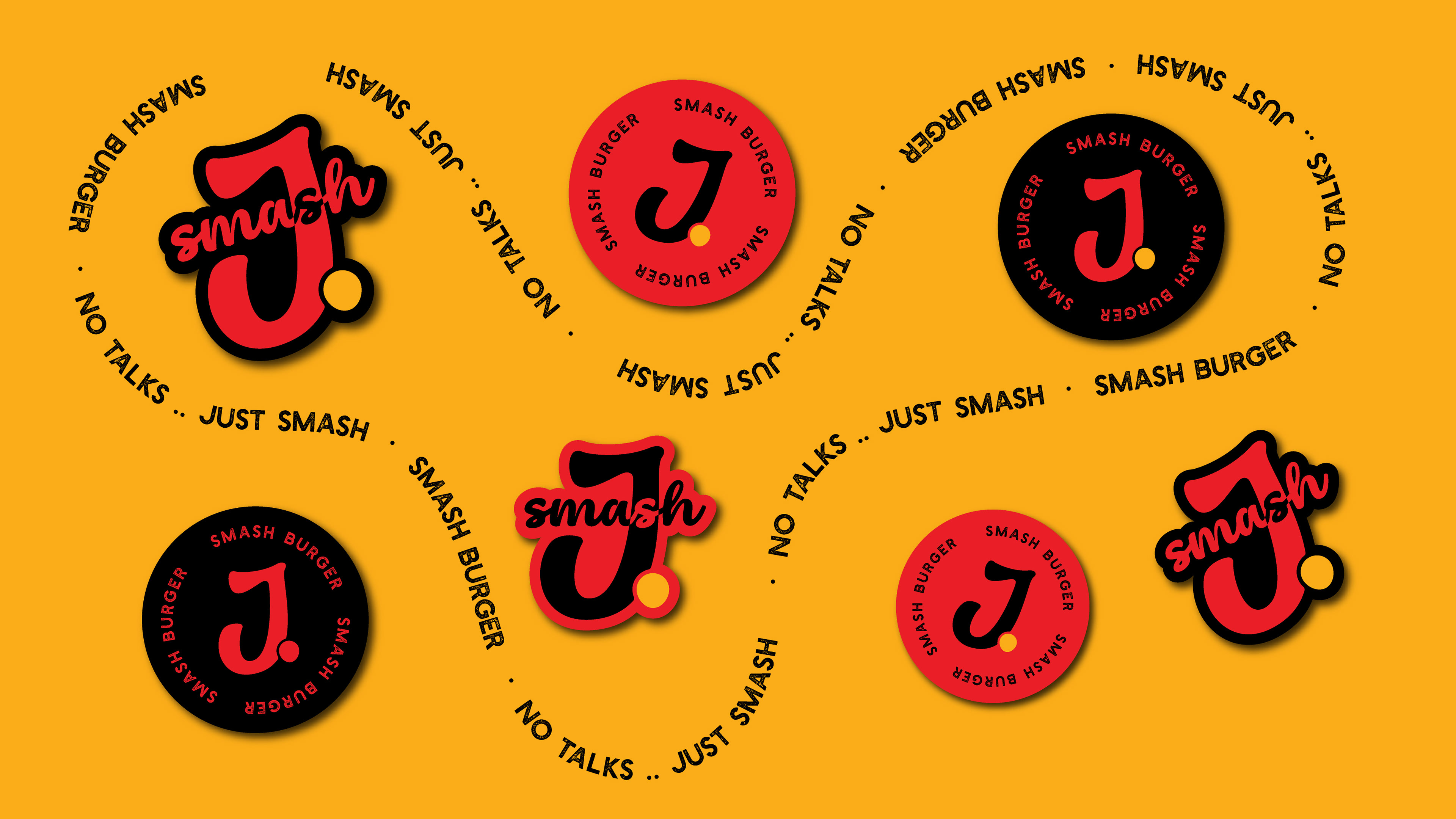
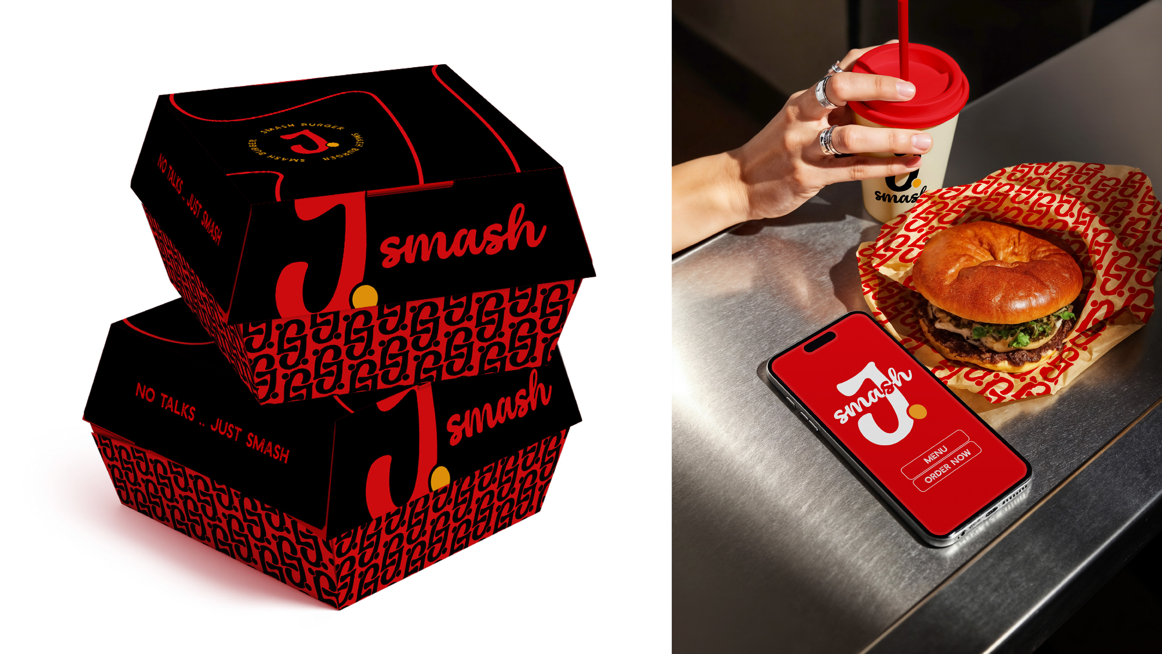
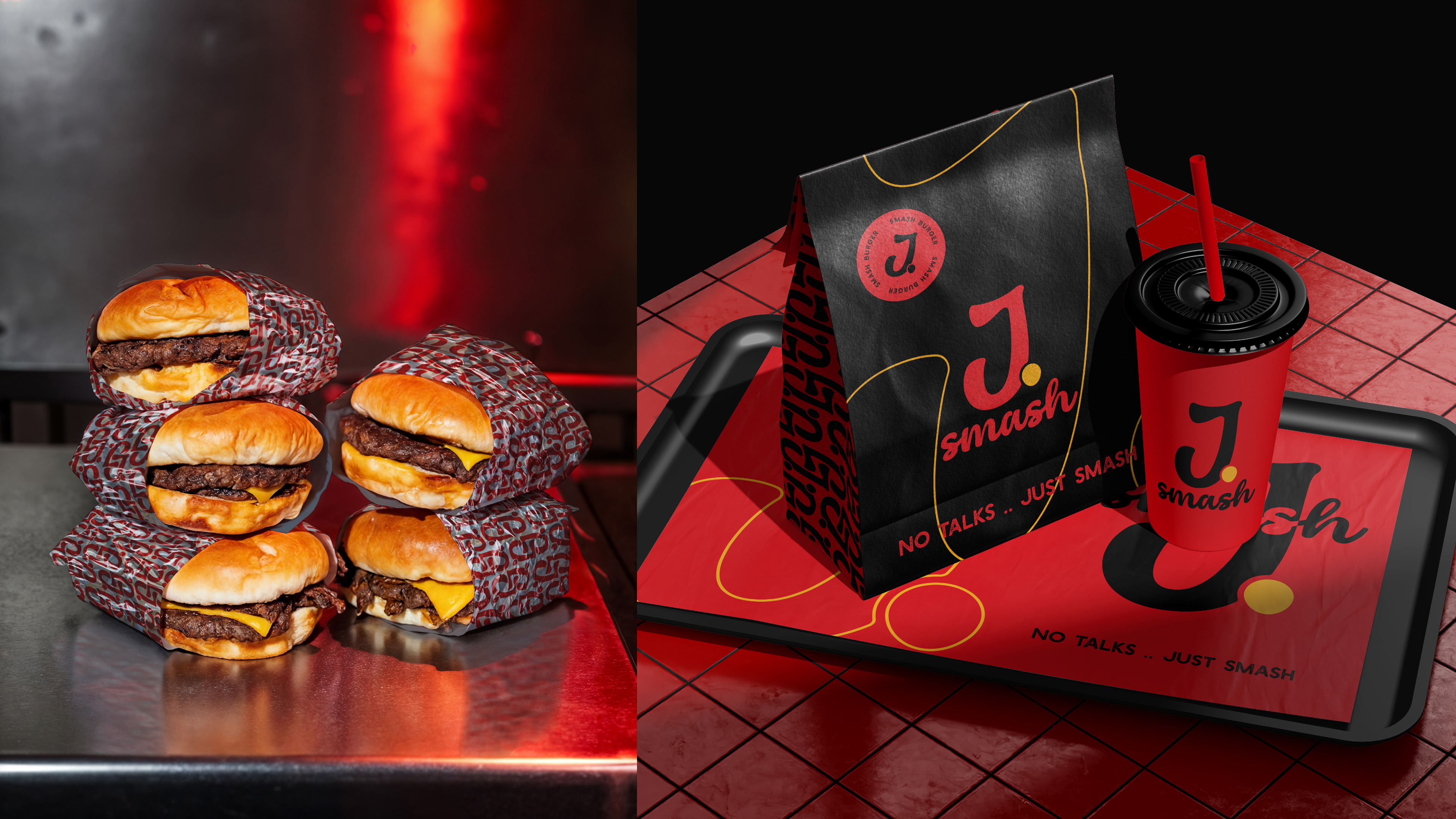
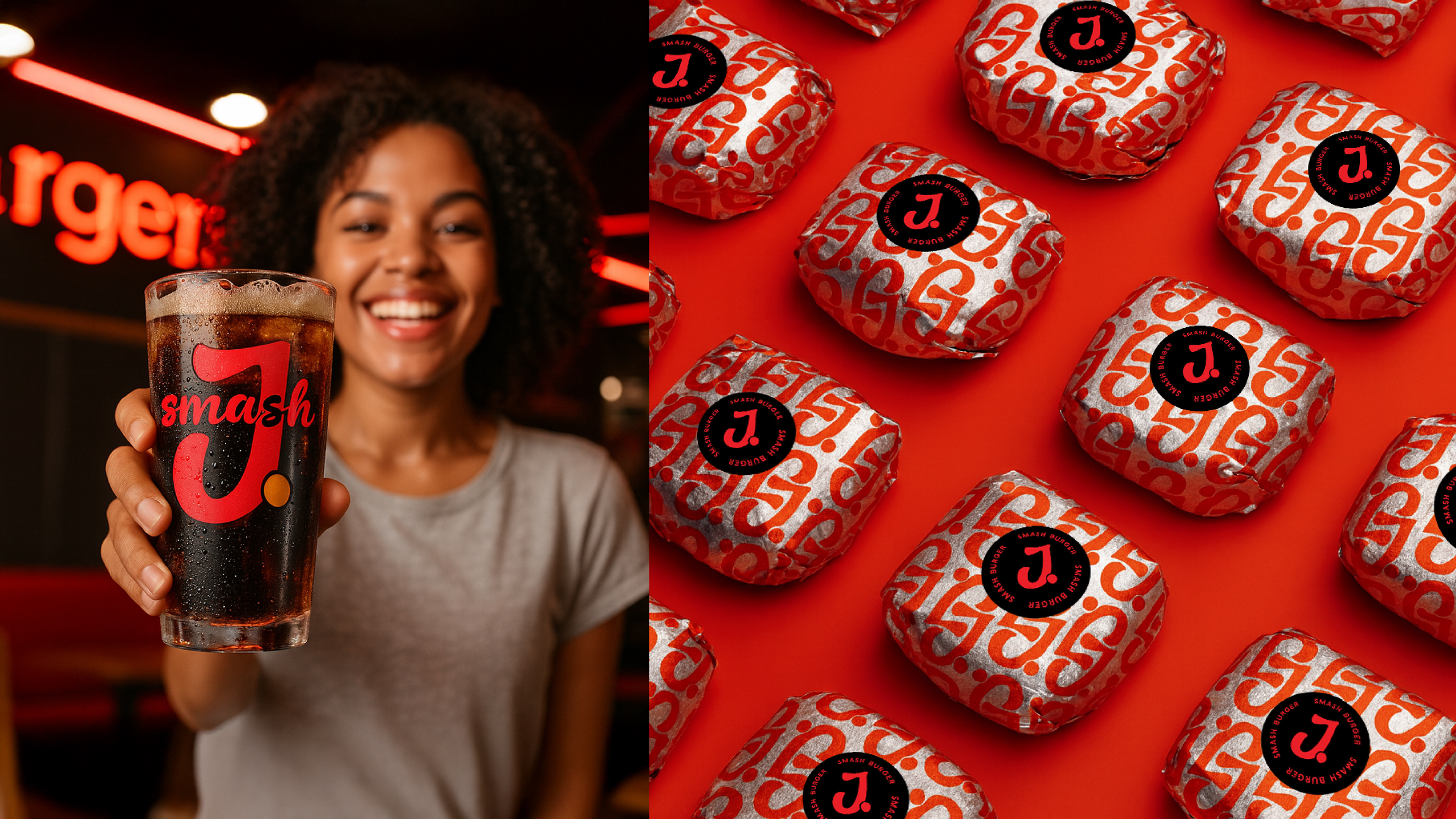
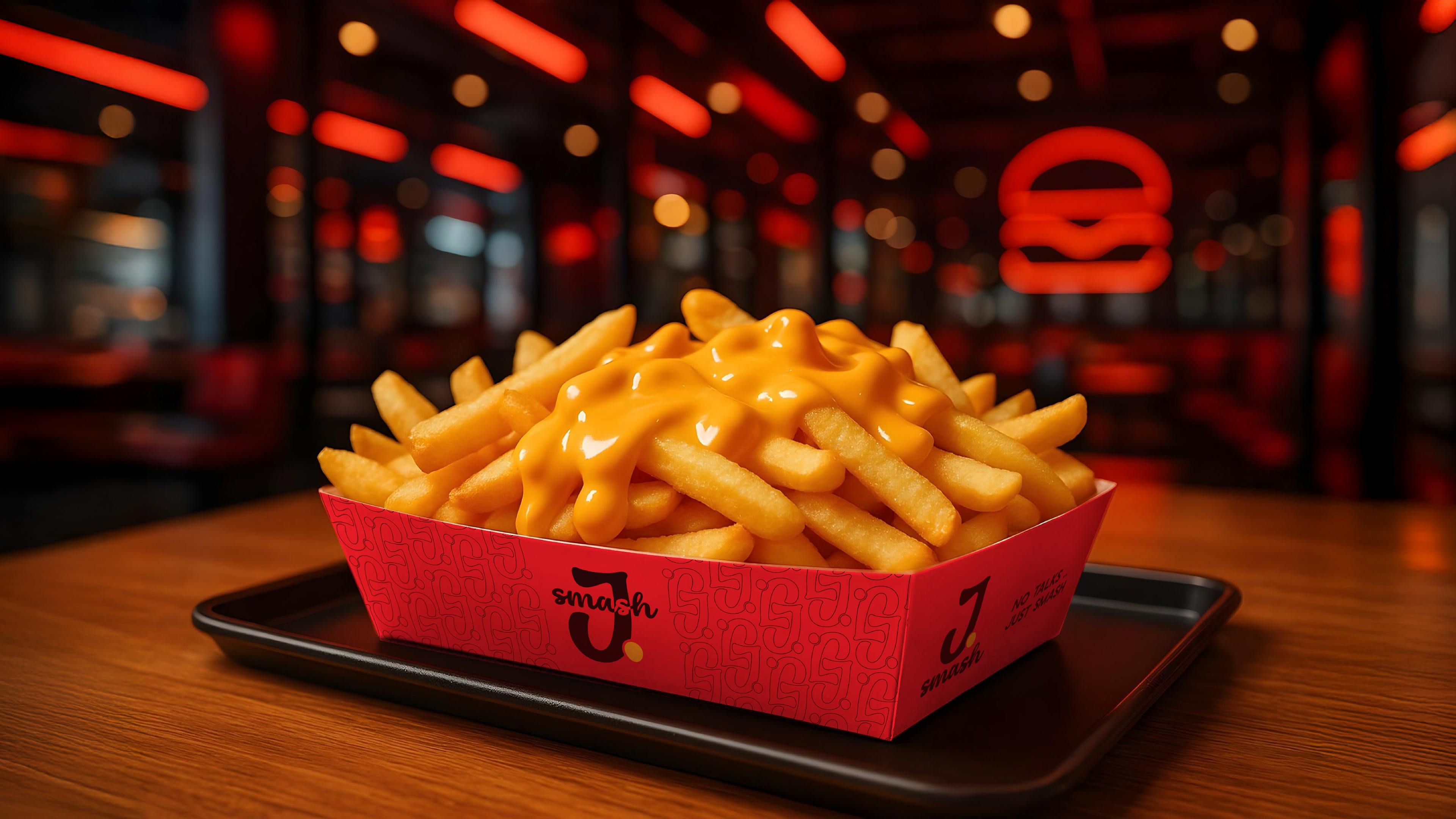
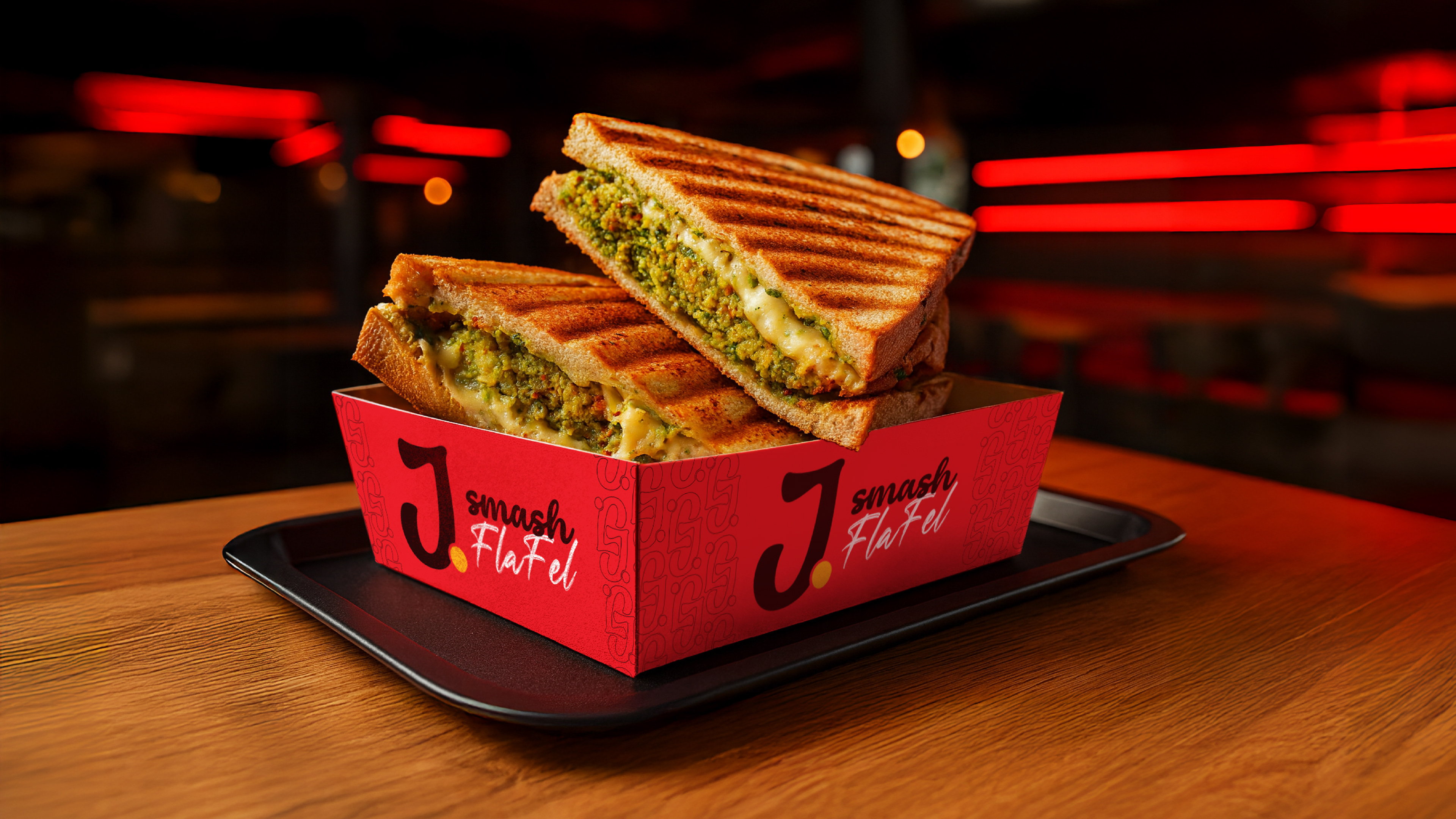
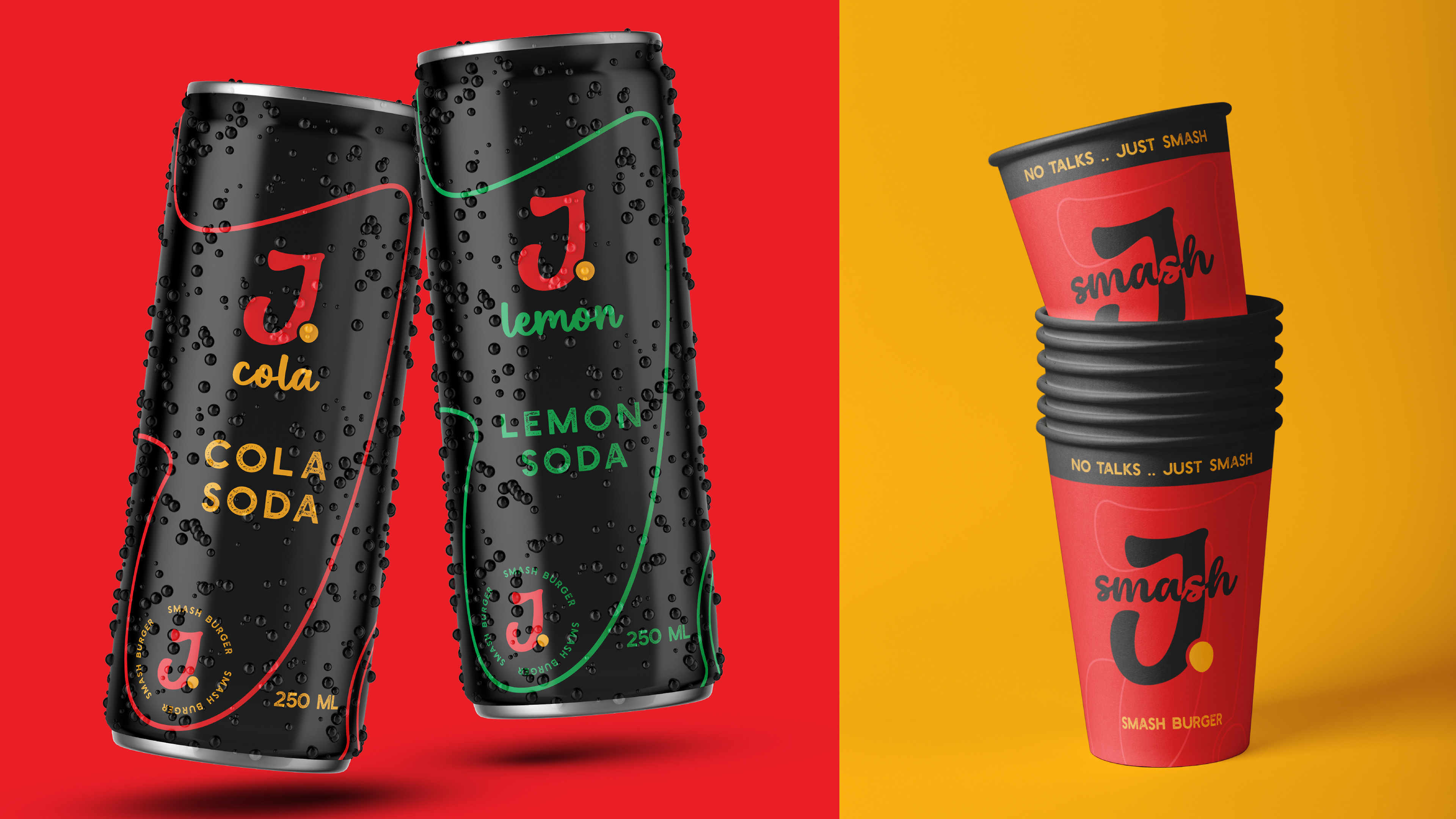
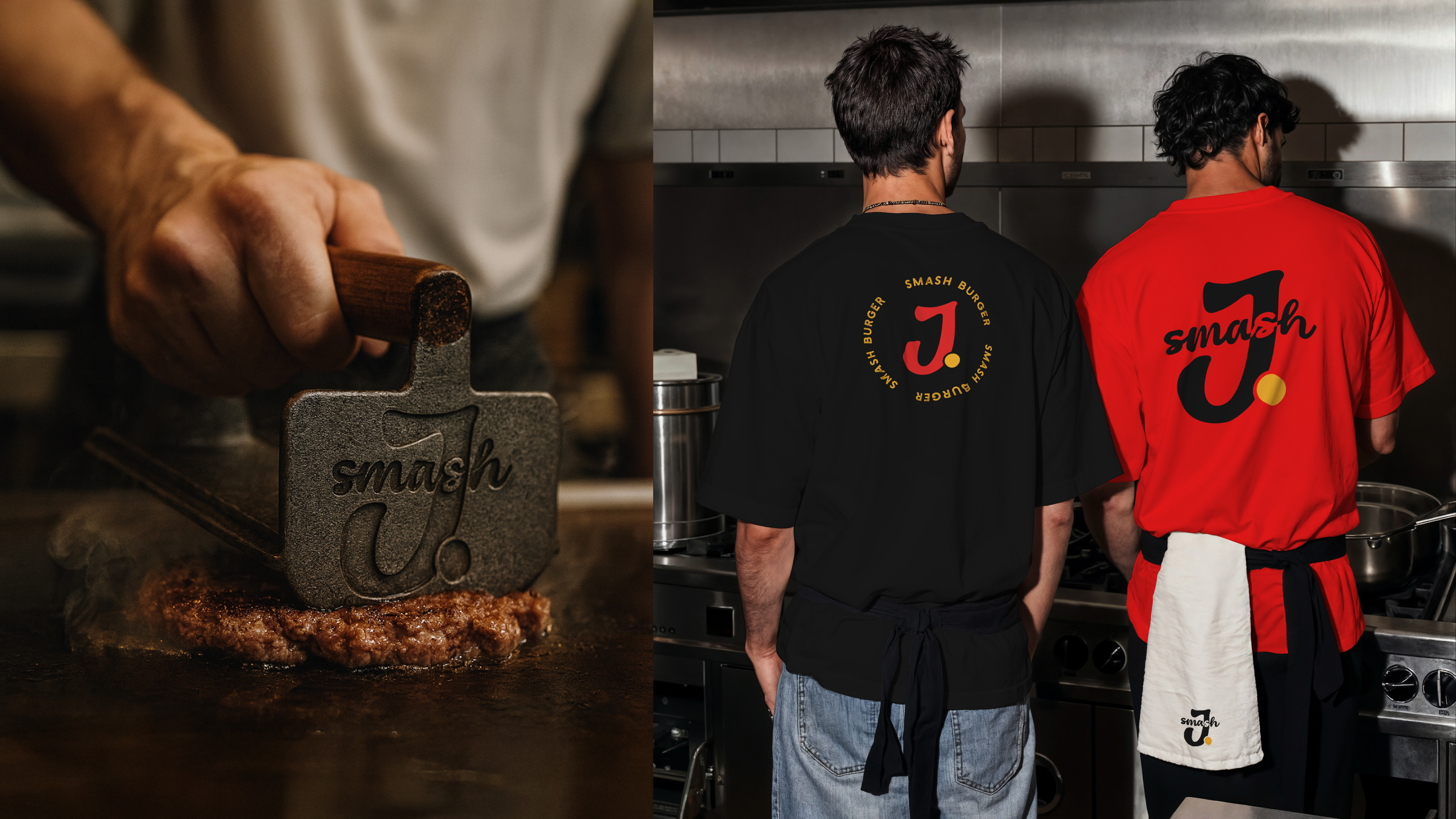
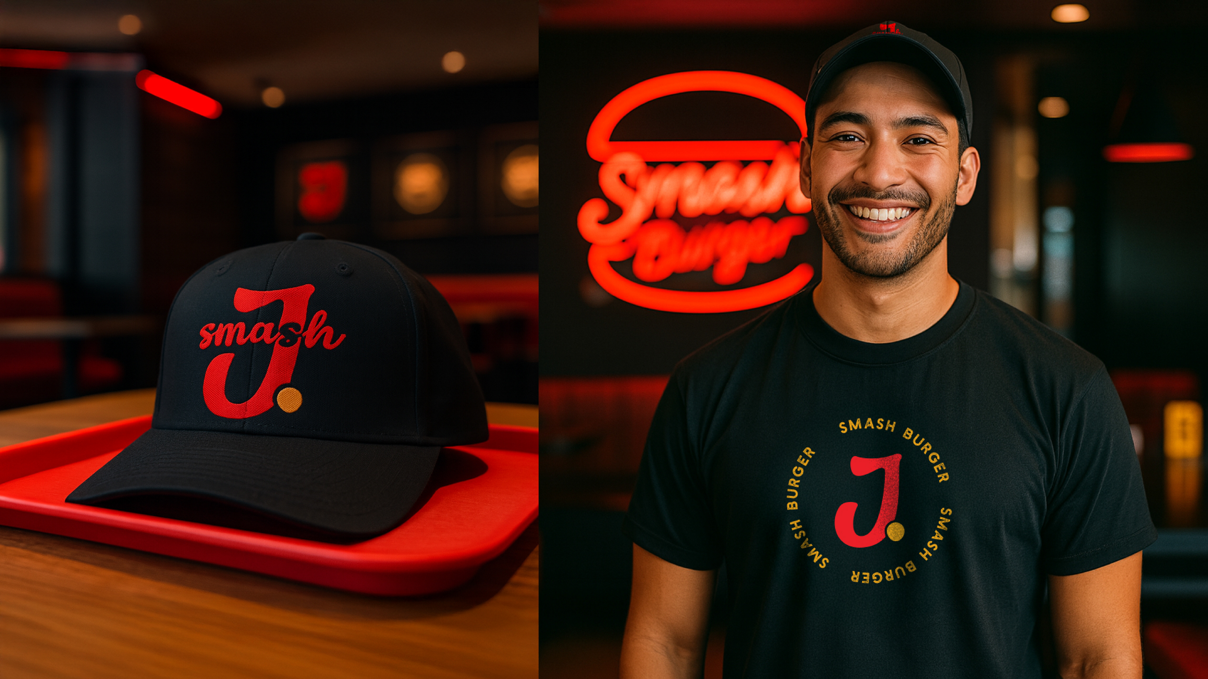
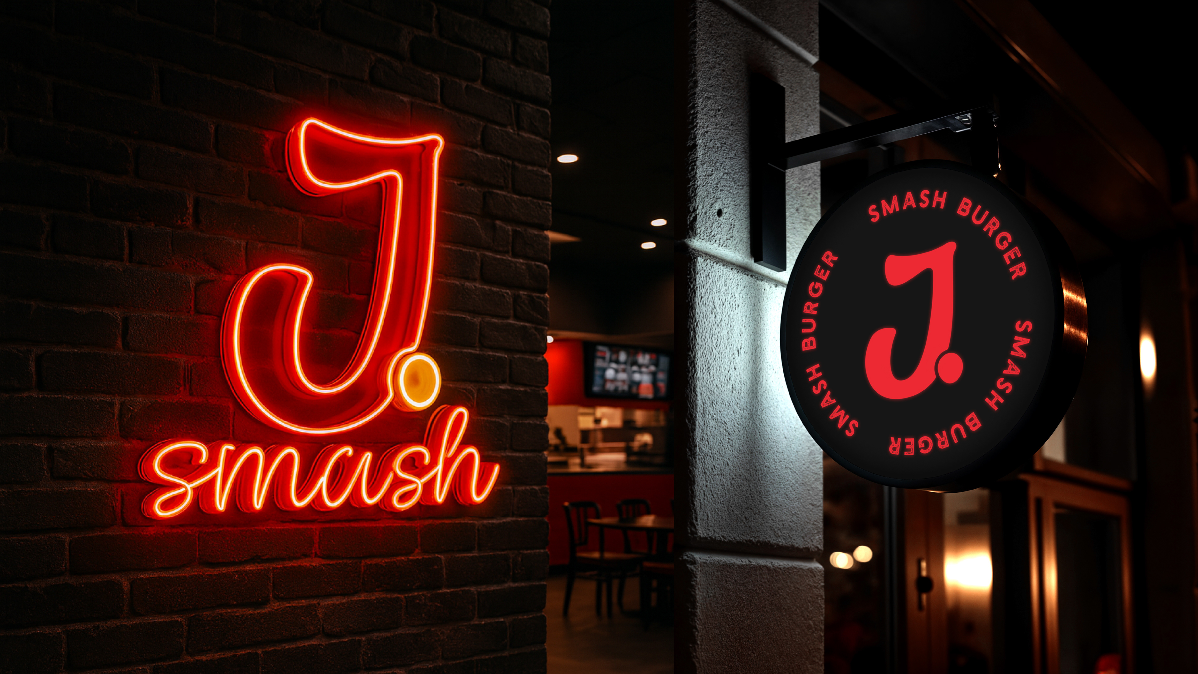
A rebrand of an existing restaurant, evolving the name from "Just Smash" to "J Smash" and rebuilding the identity around it. The logo carries the "J" from the original name, with a dot placed beside it that reads as the beef ball just before it's smashed on the grill — a direct link to the product itself. The color system pairs neon red and black with light yellow accents, built to speak to a younger, higher-energy crowd — a direction carried through to the restaurant's interior, where the same palette shows up in neon lighting.