JuicyFrenia
Client: JuicyFrenia · Industry: Juice Brand · Scope: Full Branding & Packaging
Client: JuicyFrenia · Industry: Juice Brand · Scope: Full Branding & Packaging
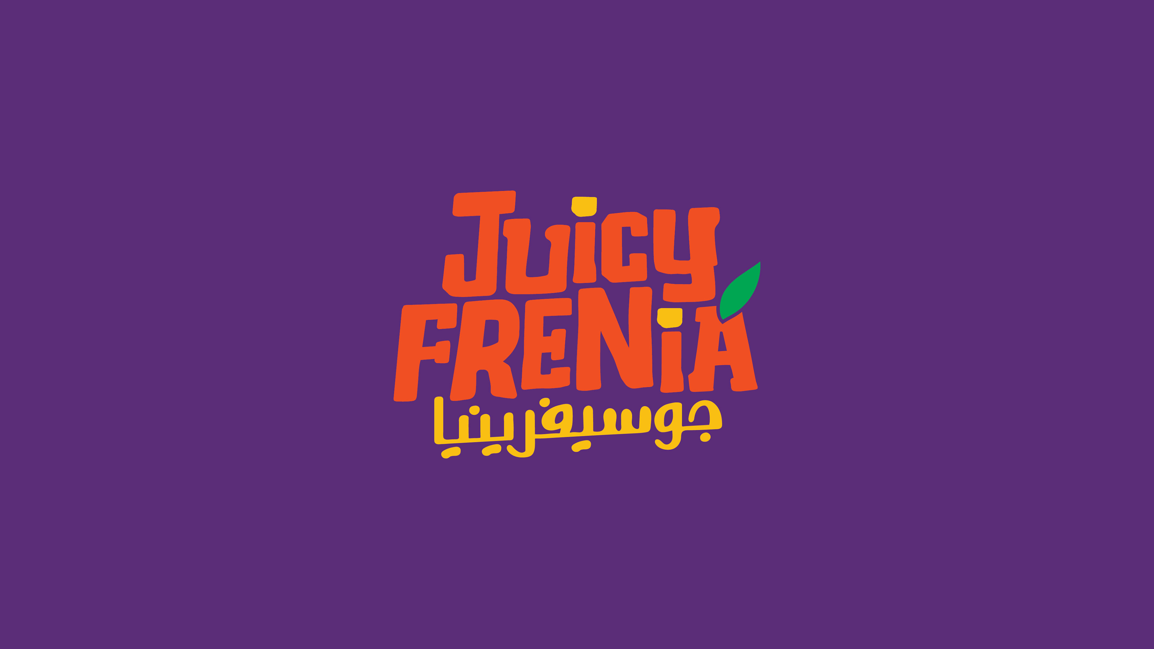
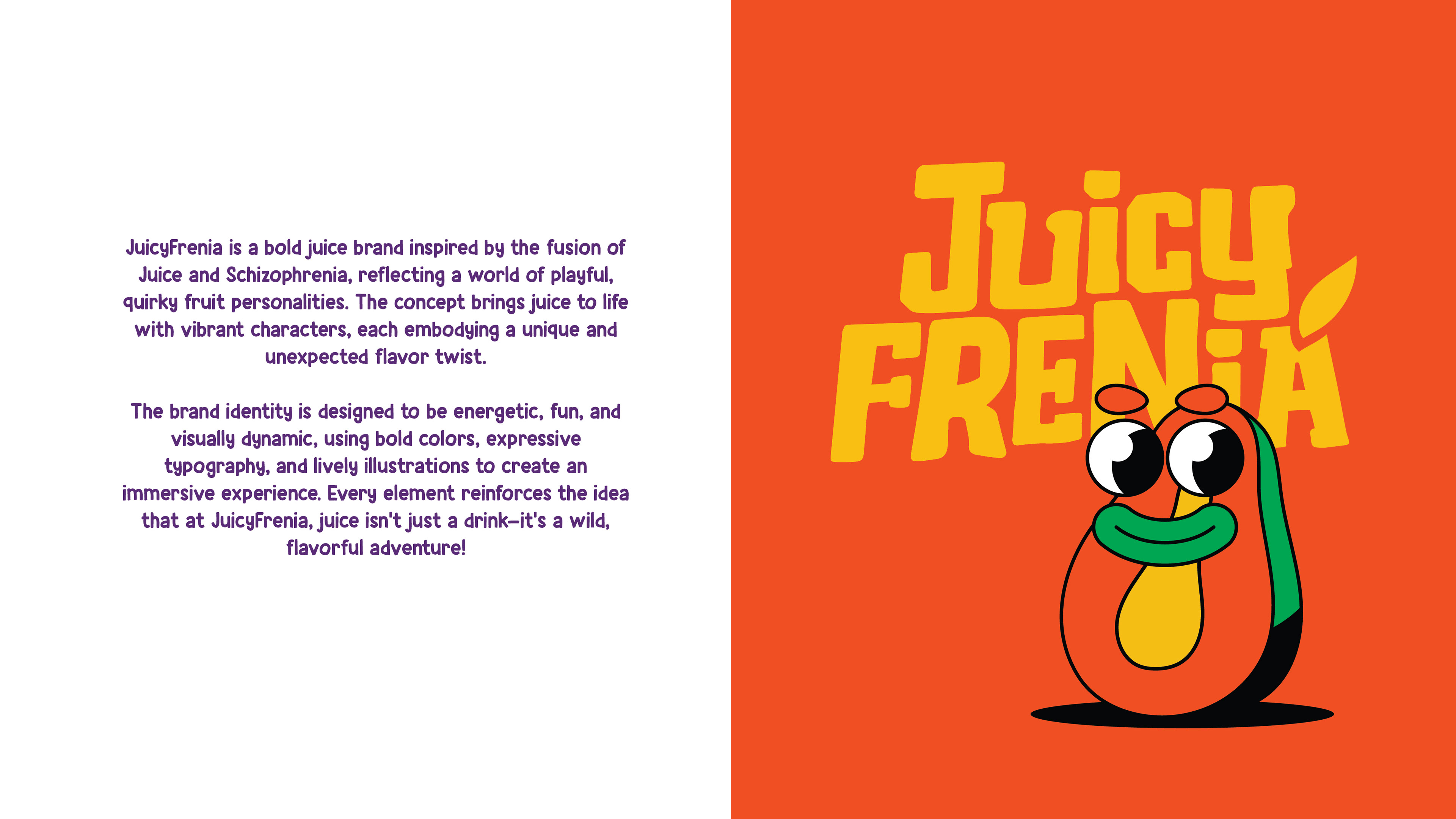
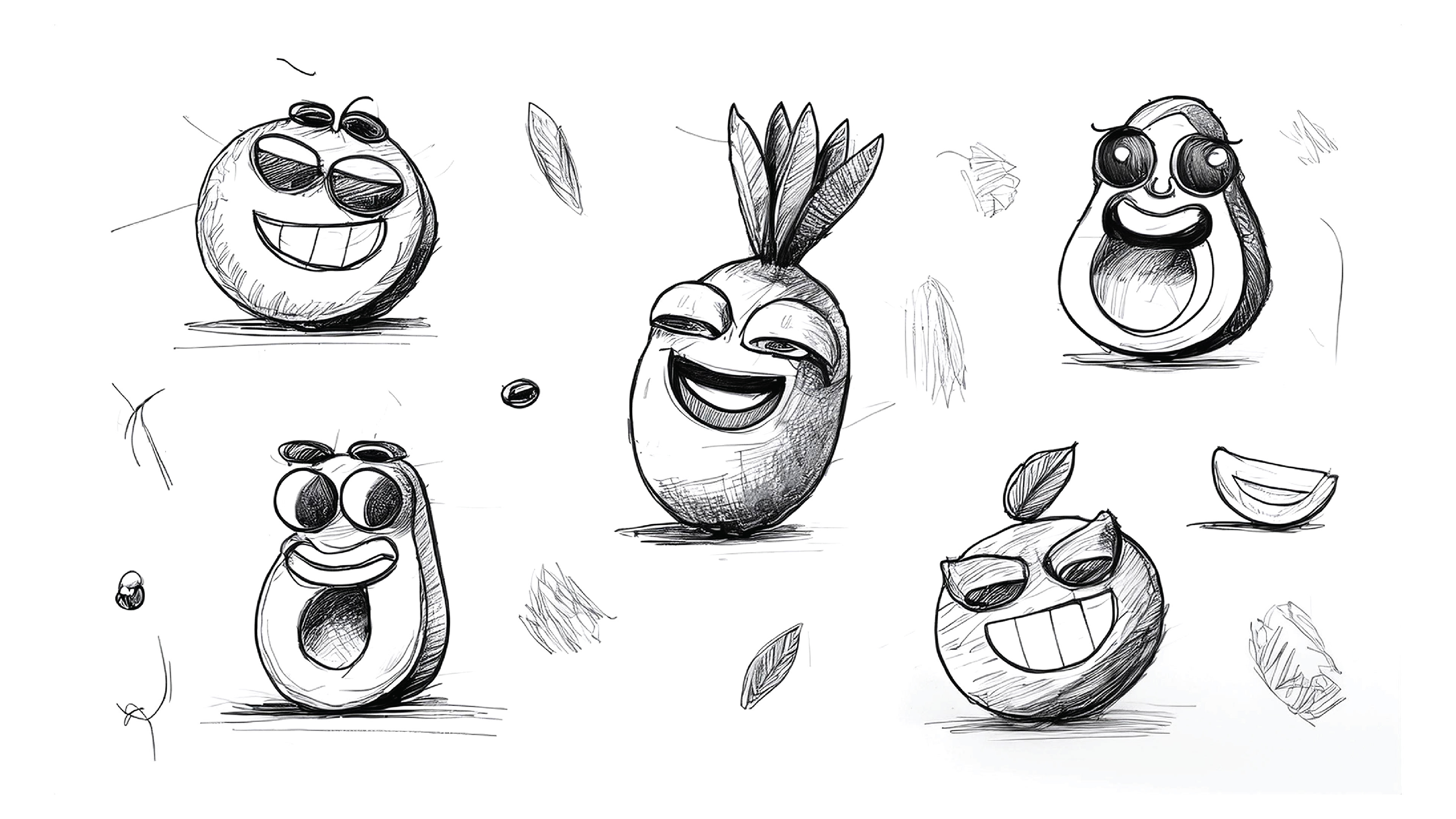
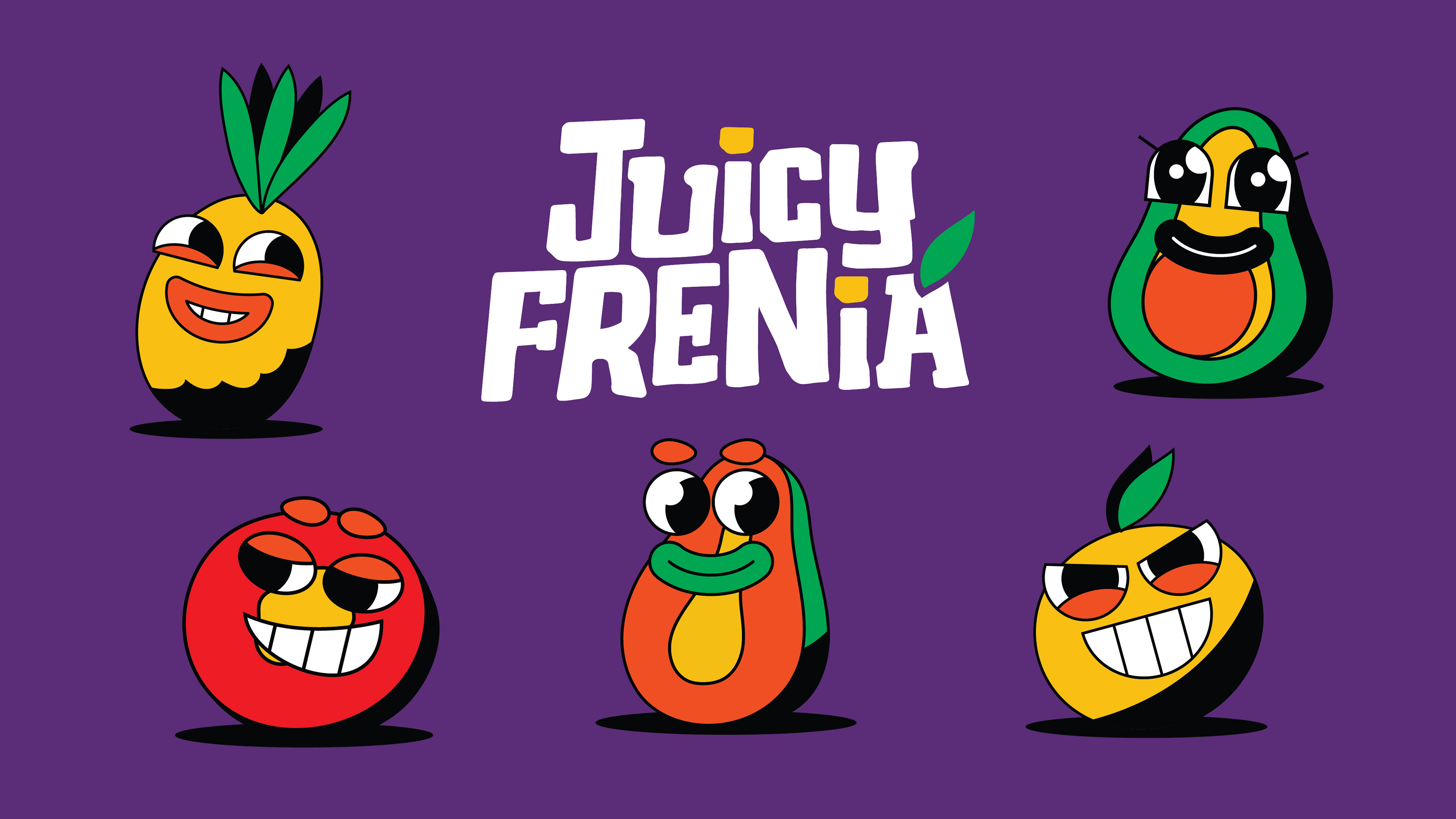
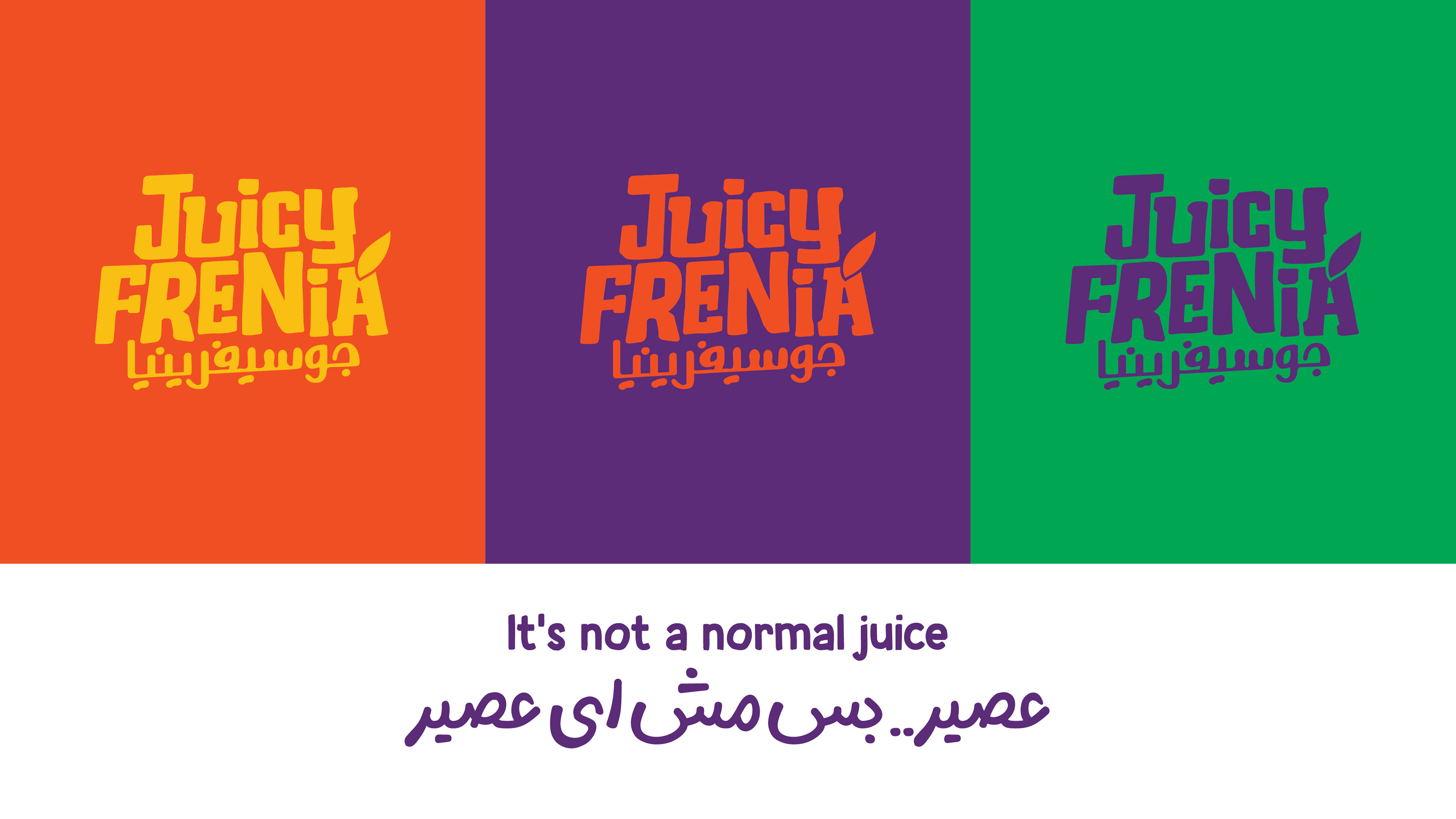
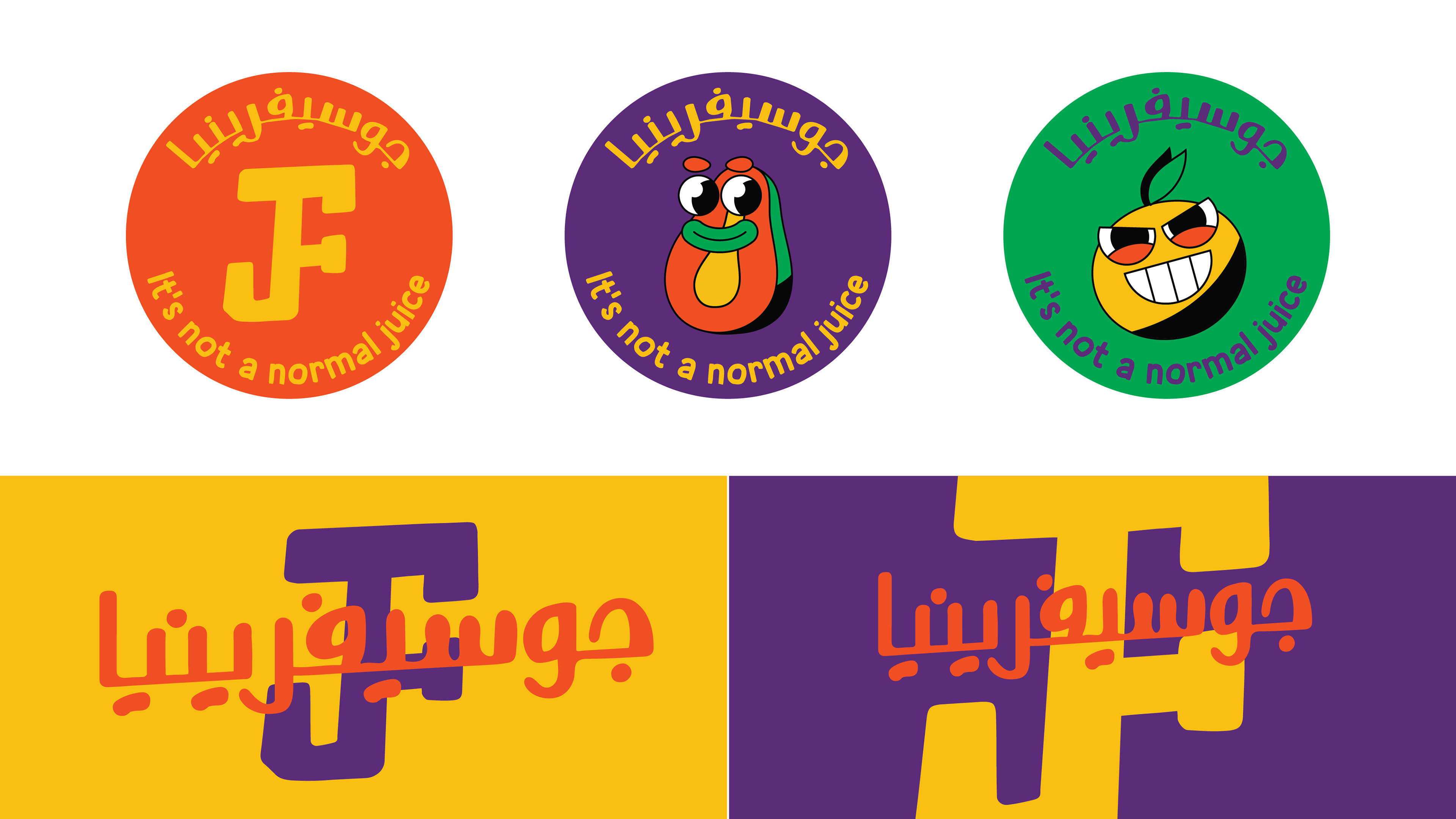
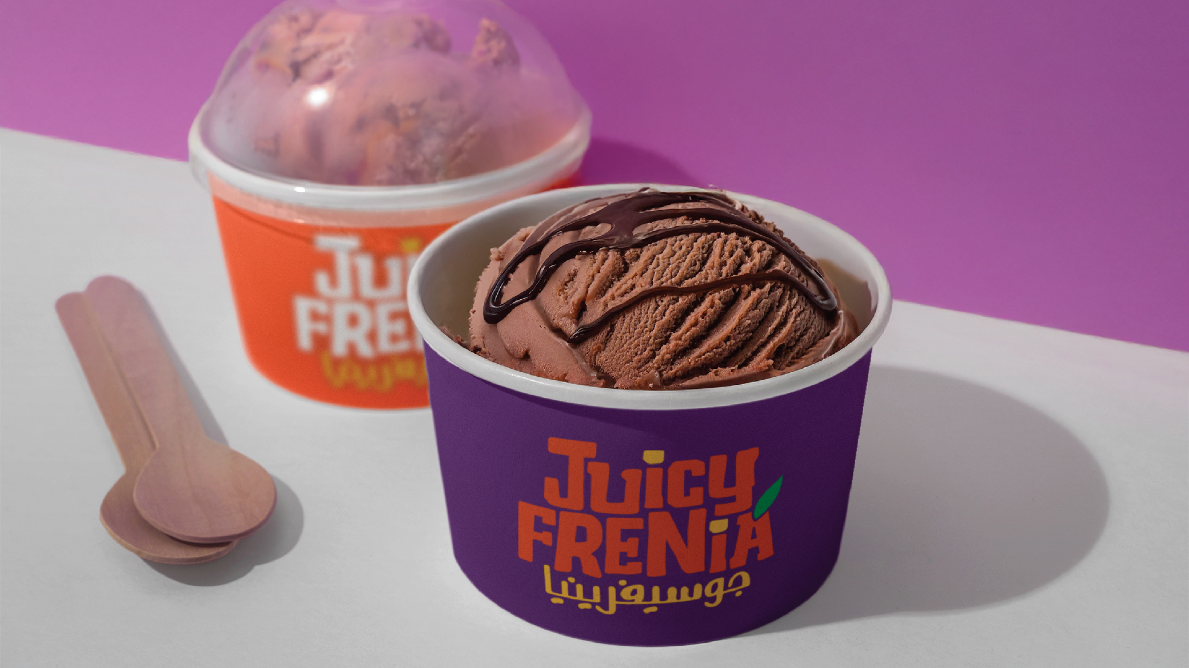
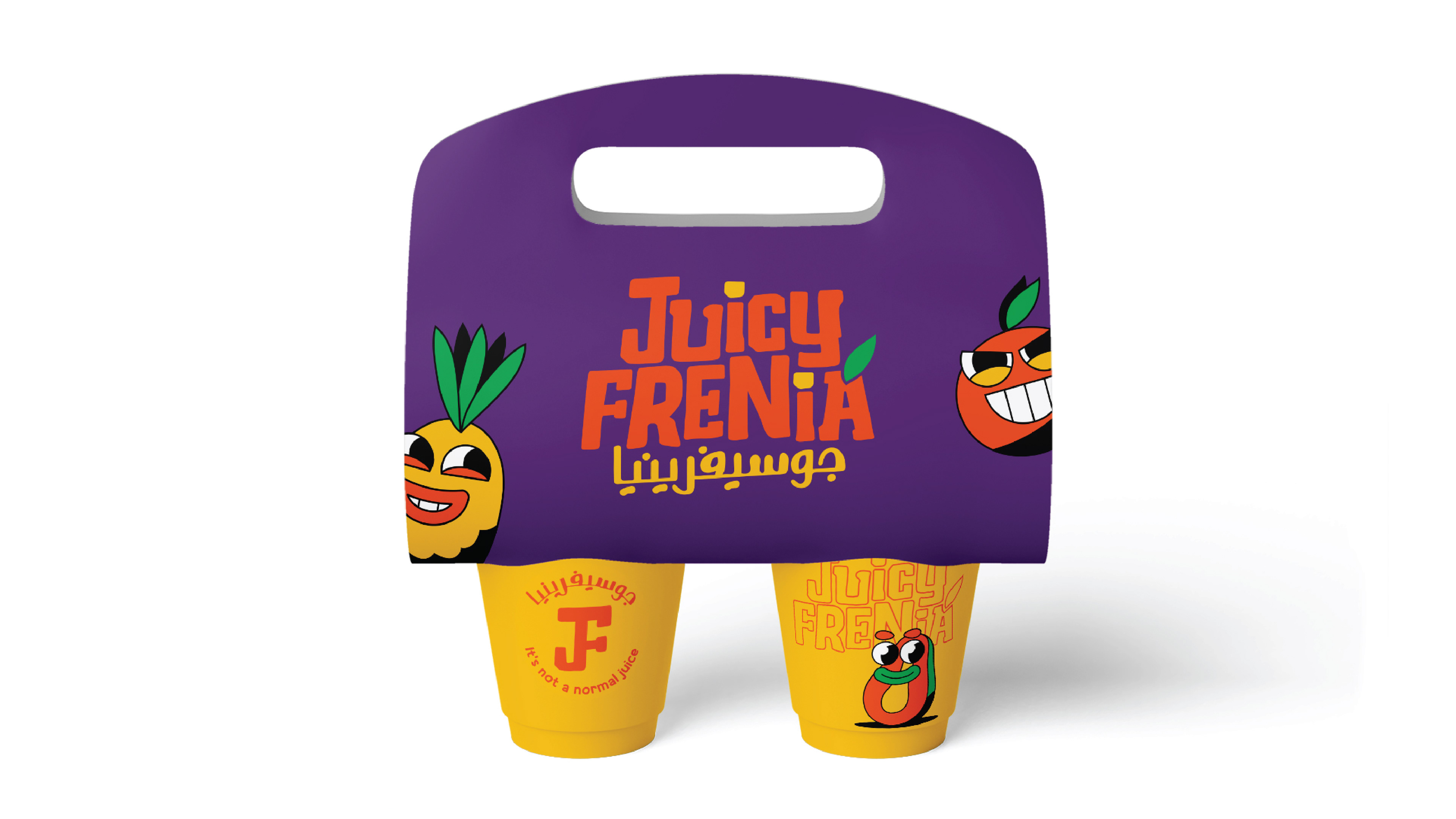
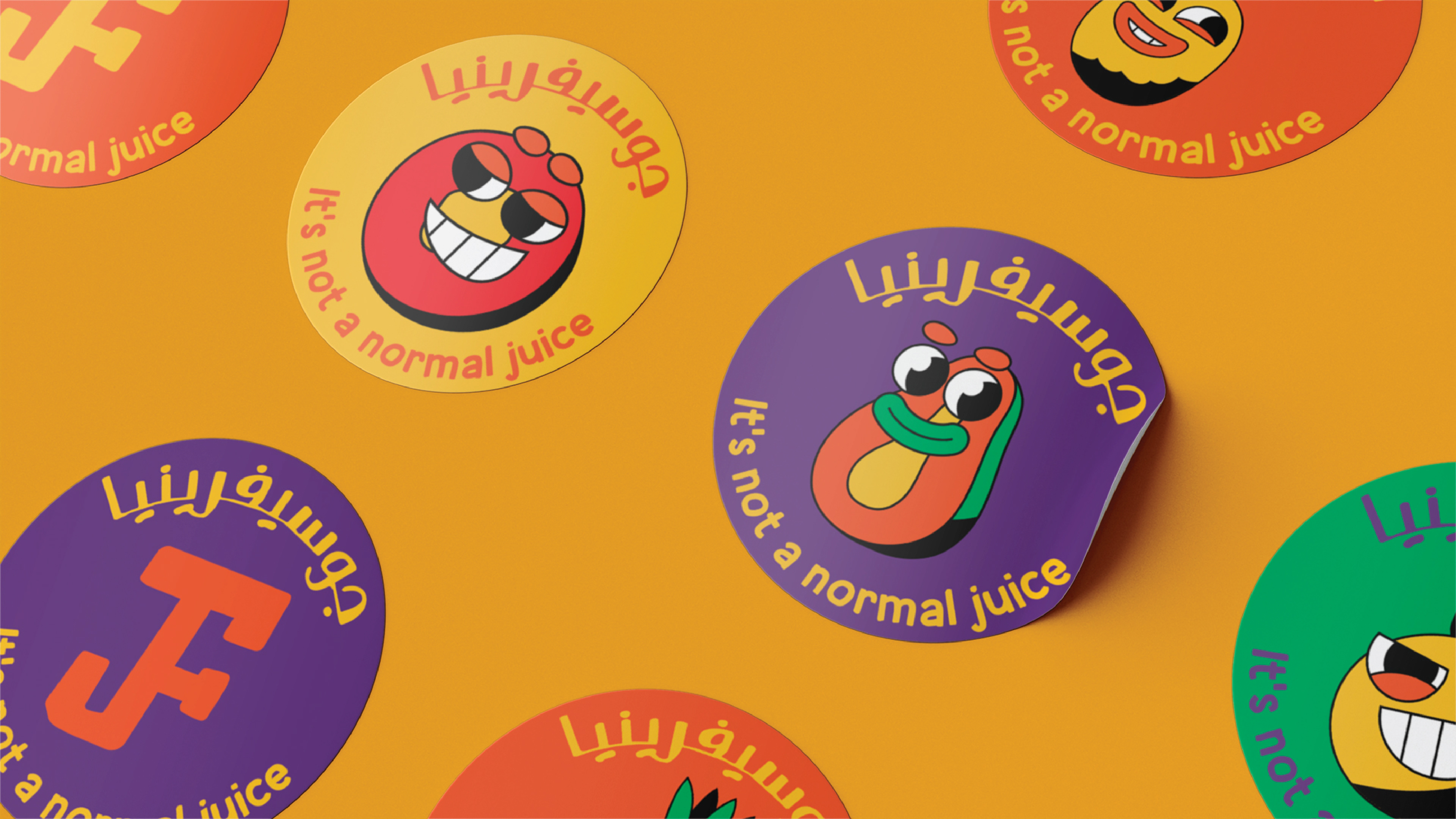
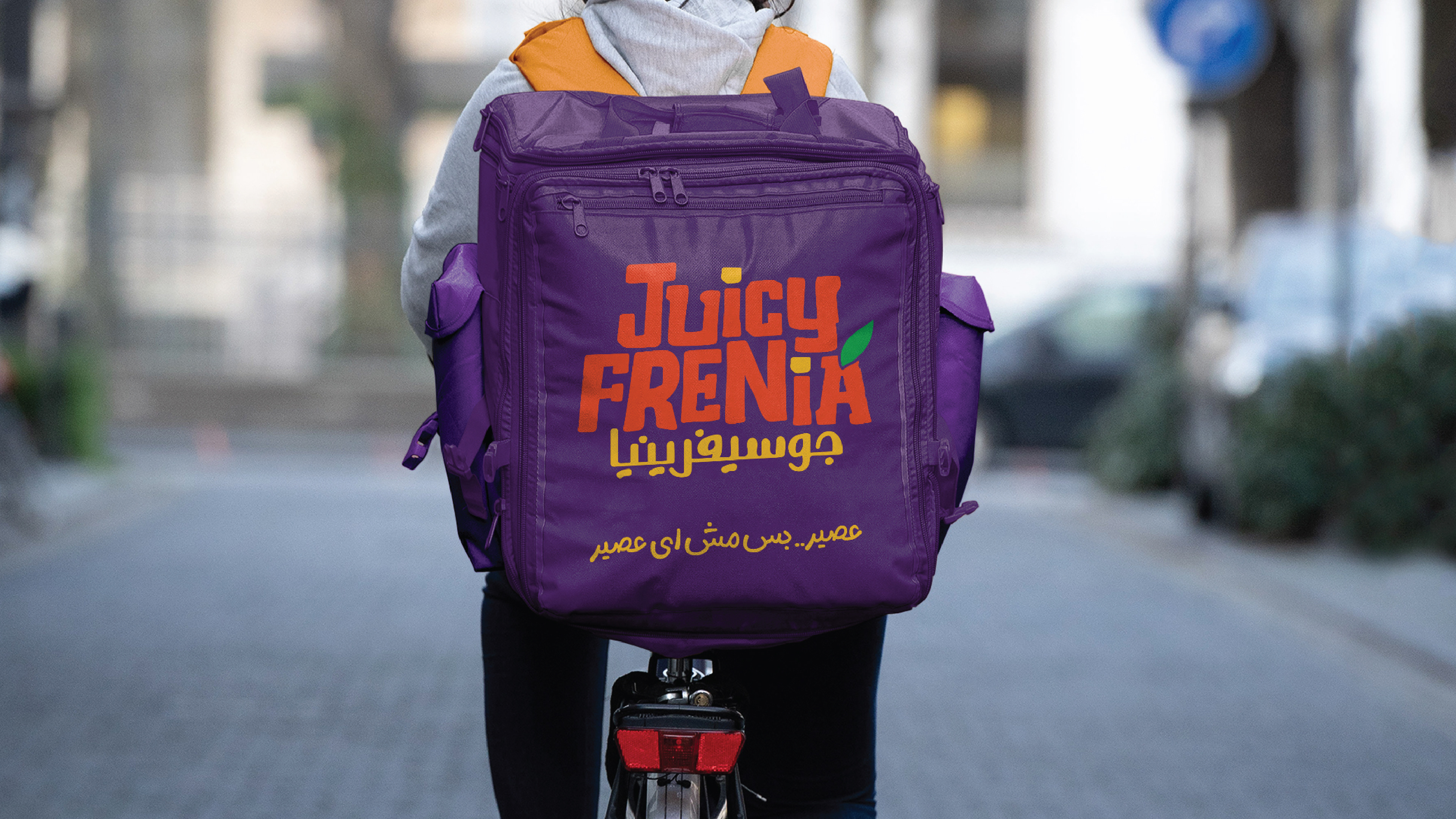
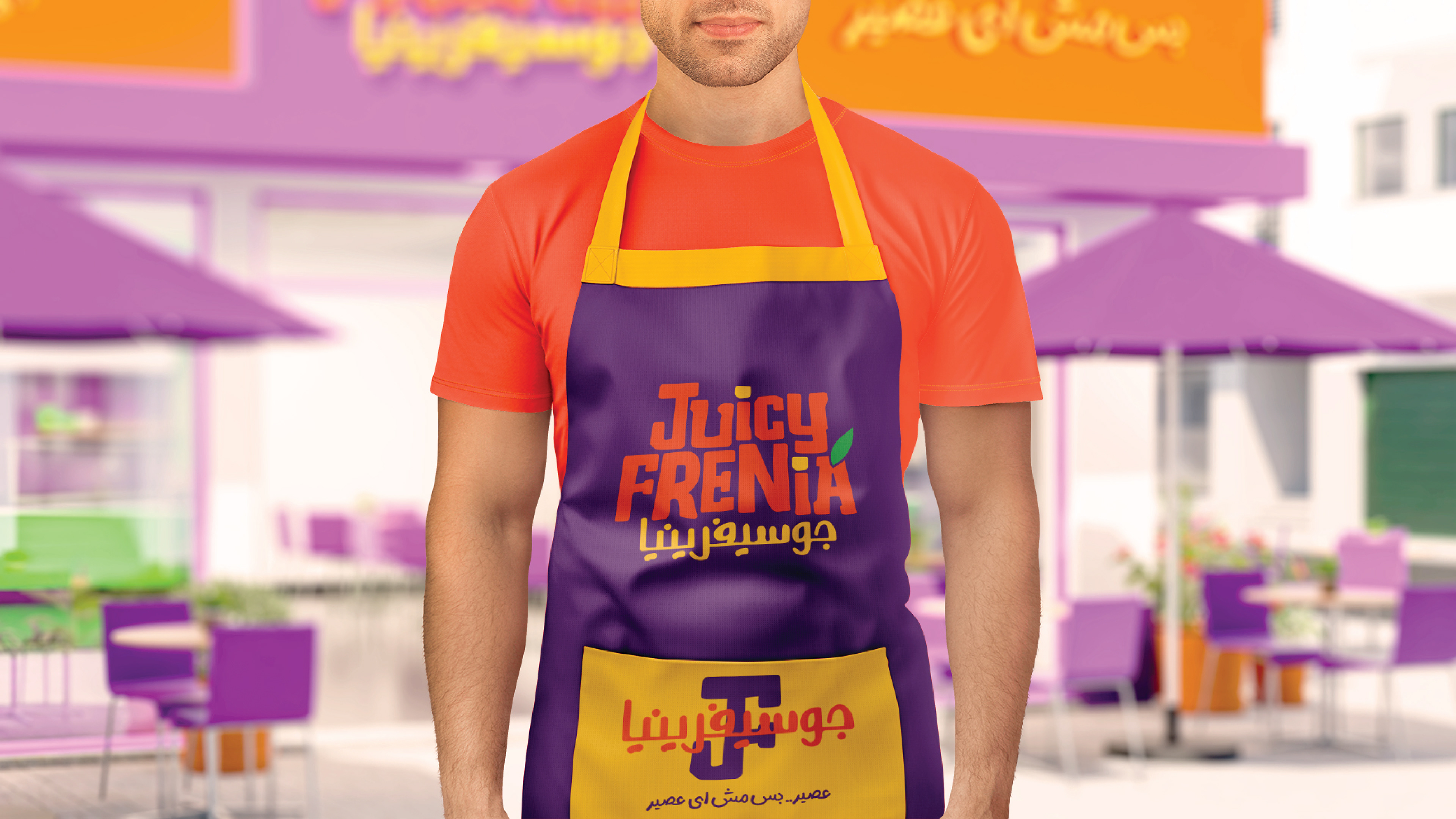
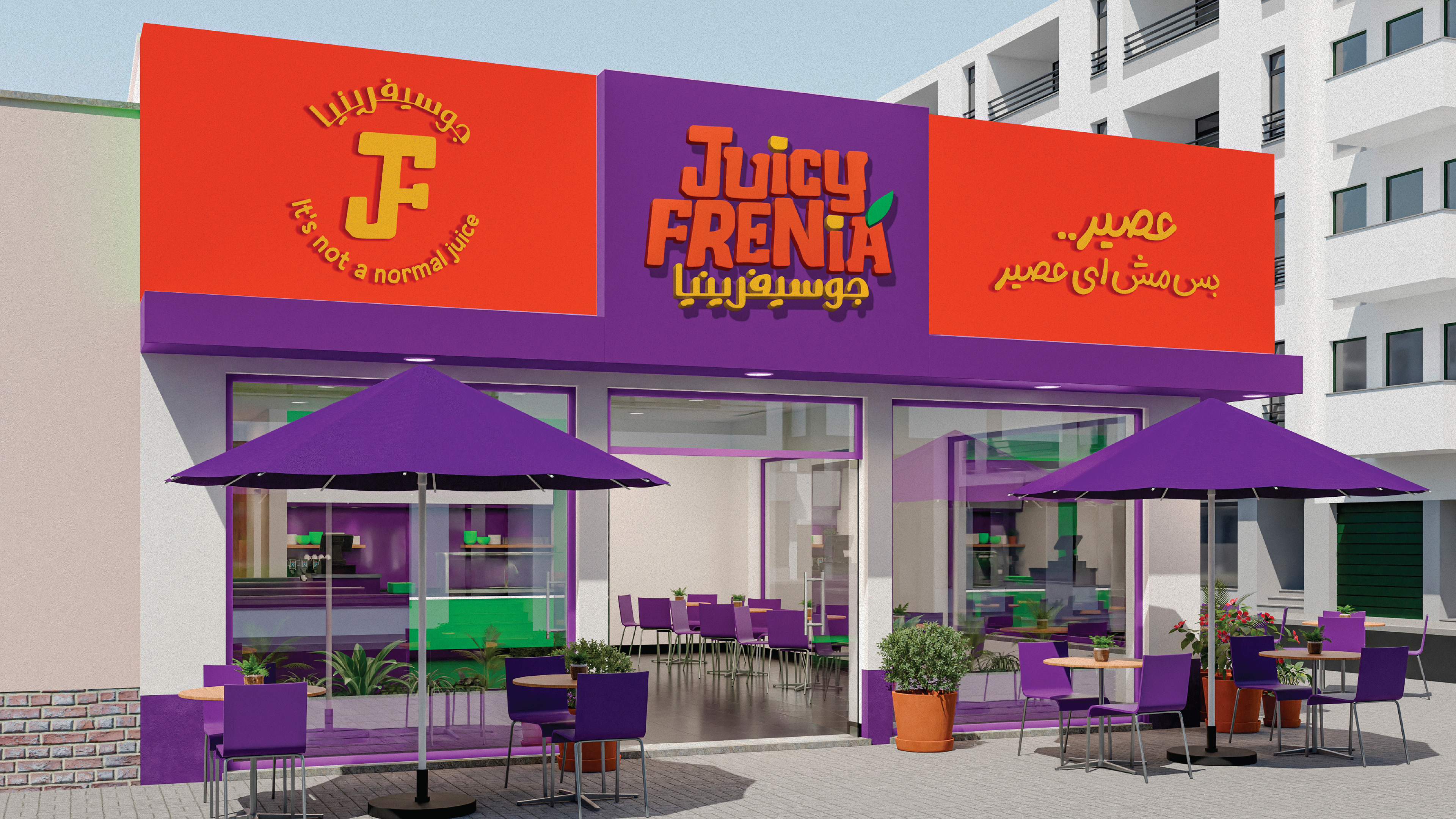
A brand identity built around a playful concept — the name itself fuses "Juice" and "Schizophrenia," reflected visually through a set of fruit characters, each given its own quirky personality. The logo's typography carries that duality directly: broken, jagged letterforms that lean into a playful horror-movie feel and the icon joins the "J" and "F" into a single connected mark, paired with a color palette that stays bold and vibrant throughout — aimed at a younger audience drawn to loud, expressive branding over anything minimal.