Qasioun Express
Client: Qasioun Express · Industry: Logistics & Delivery · Scope: Full Branding
Client: Qasioun Express · Industry: Logistics & Delivery · Scope: Full Branding
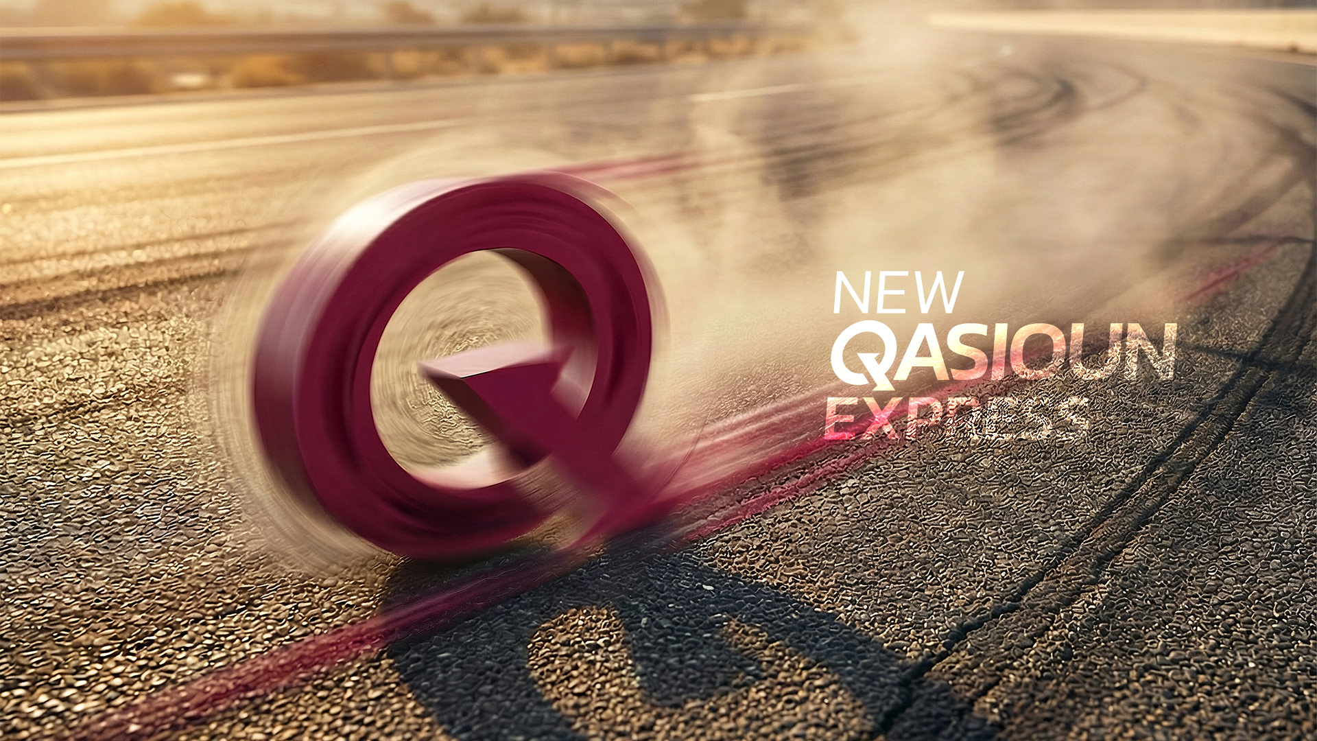
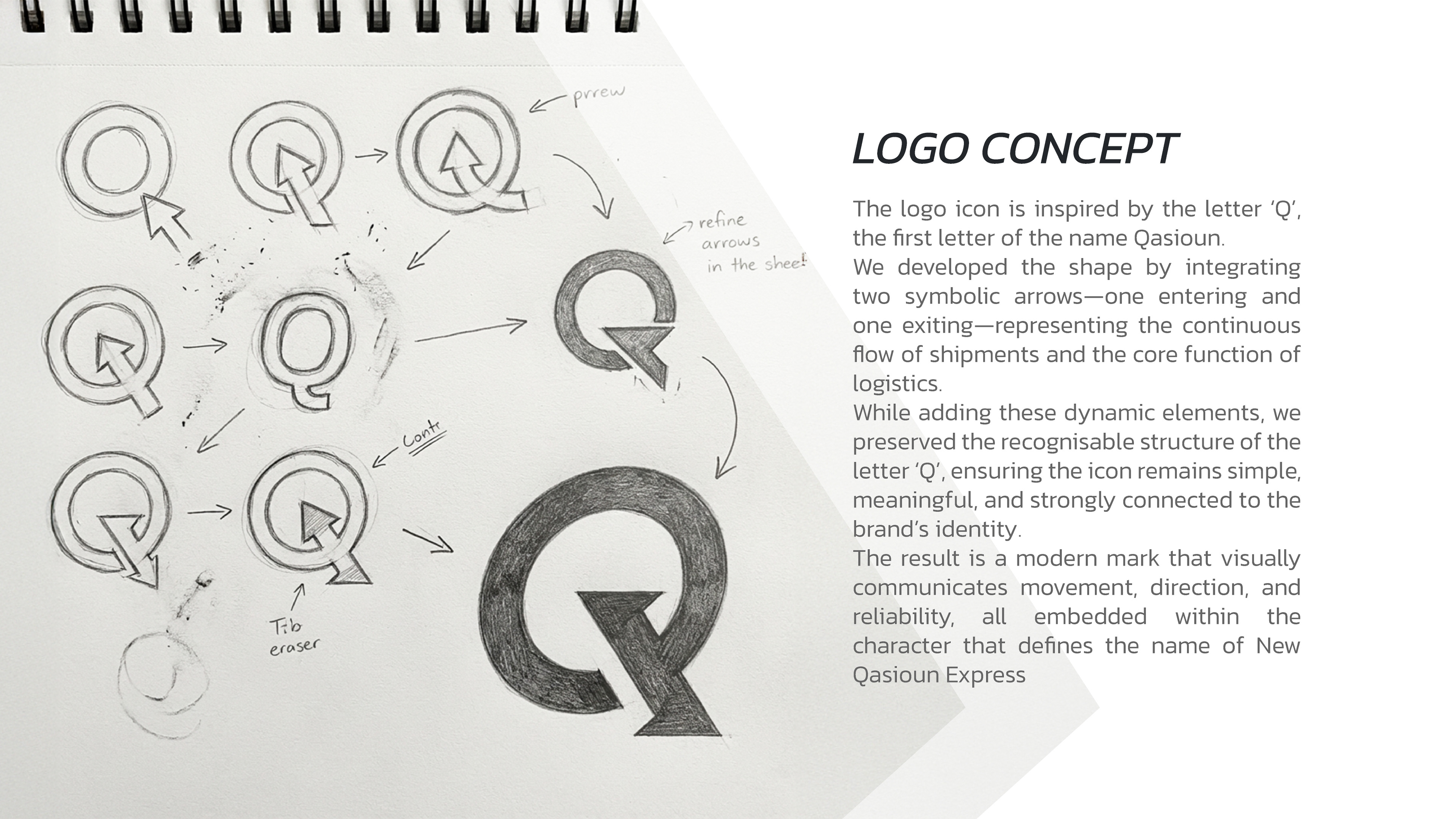
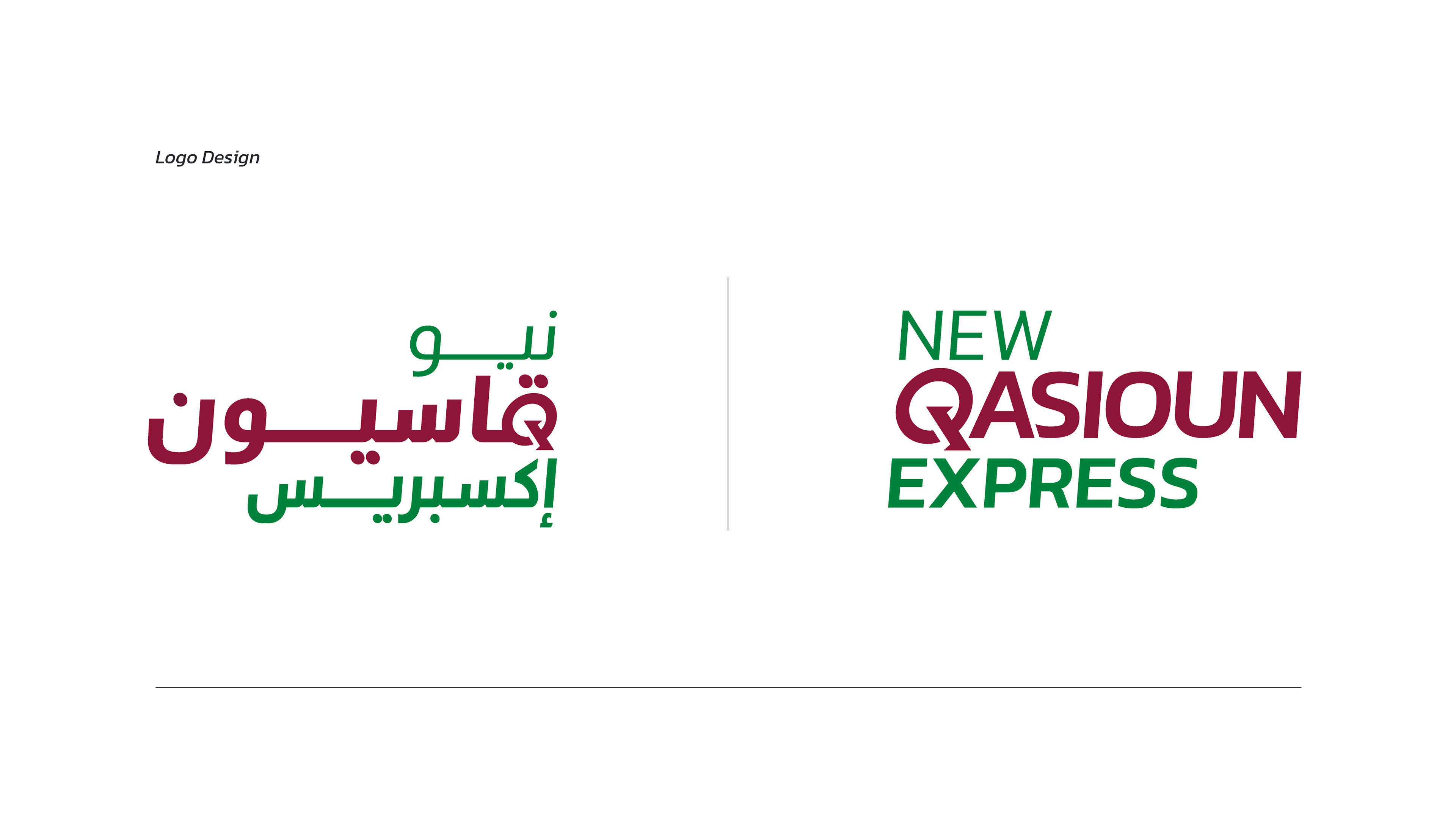
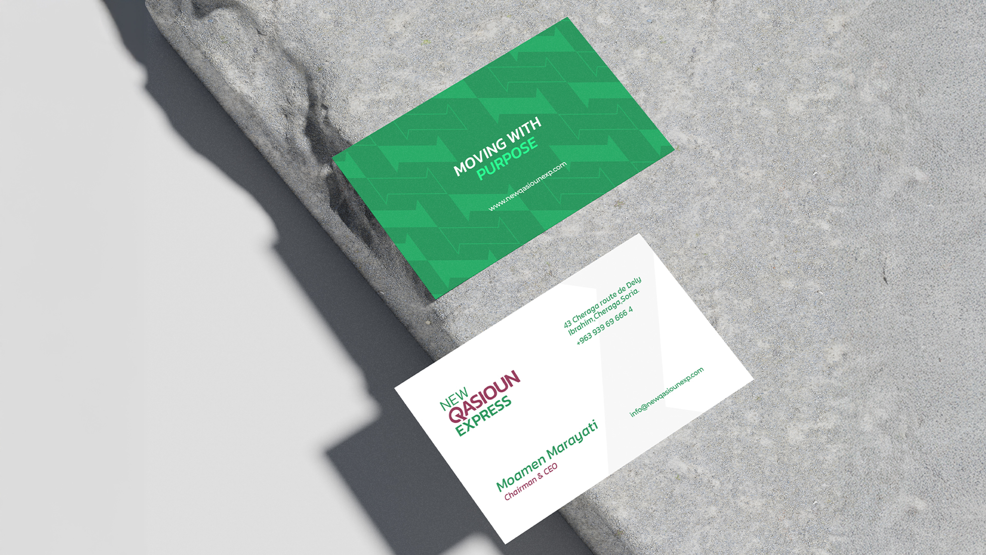
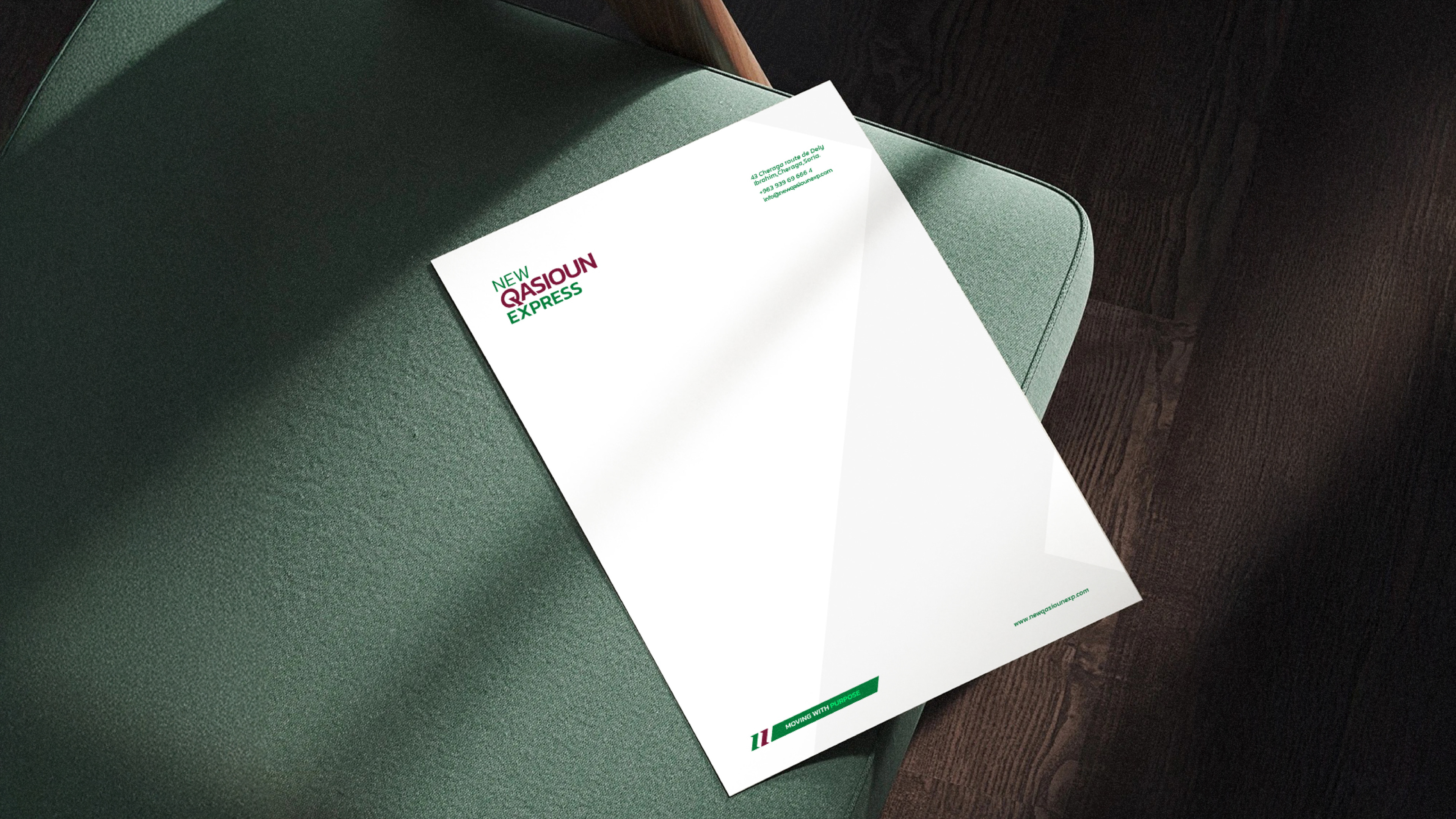
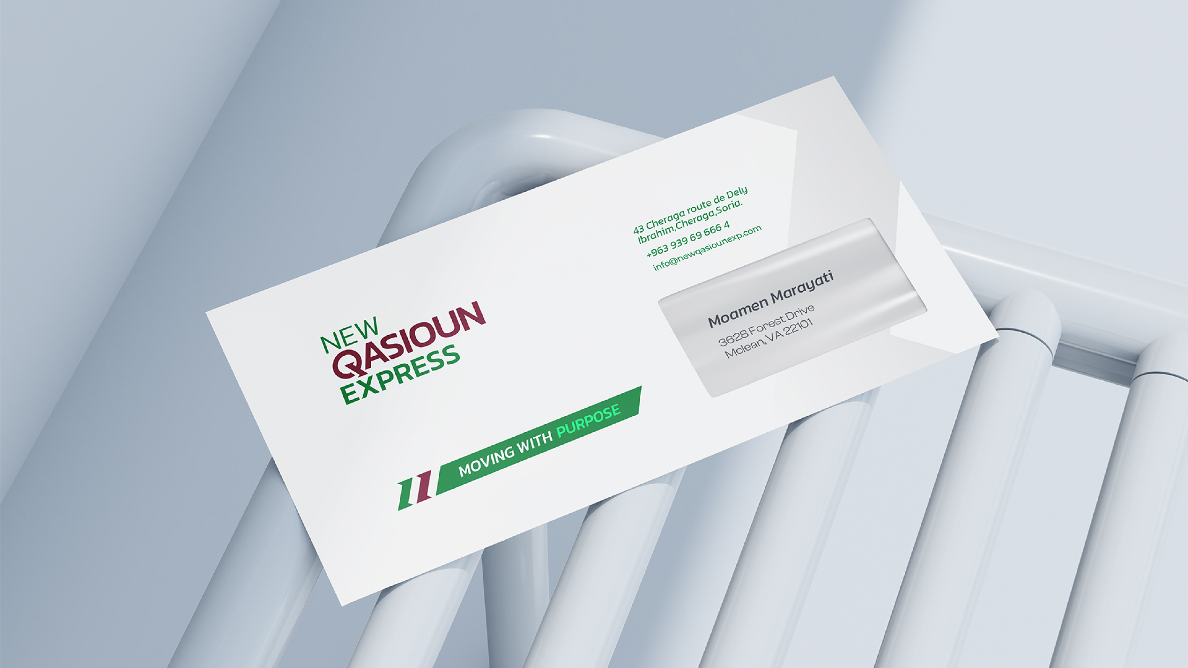
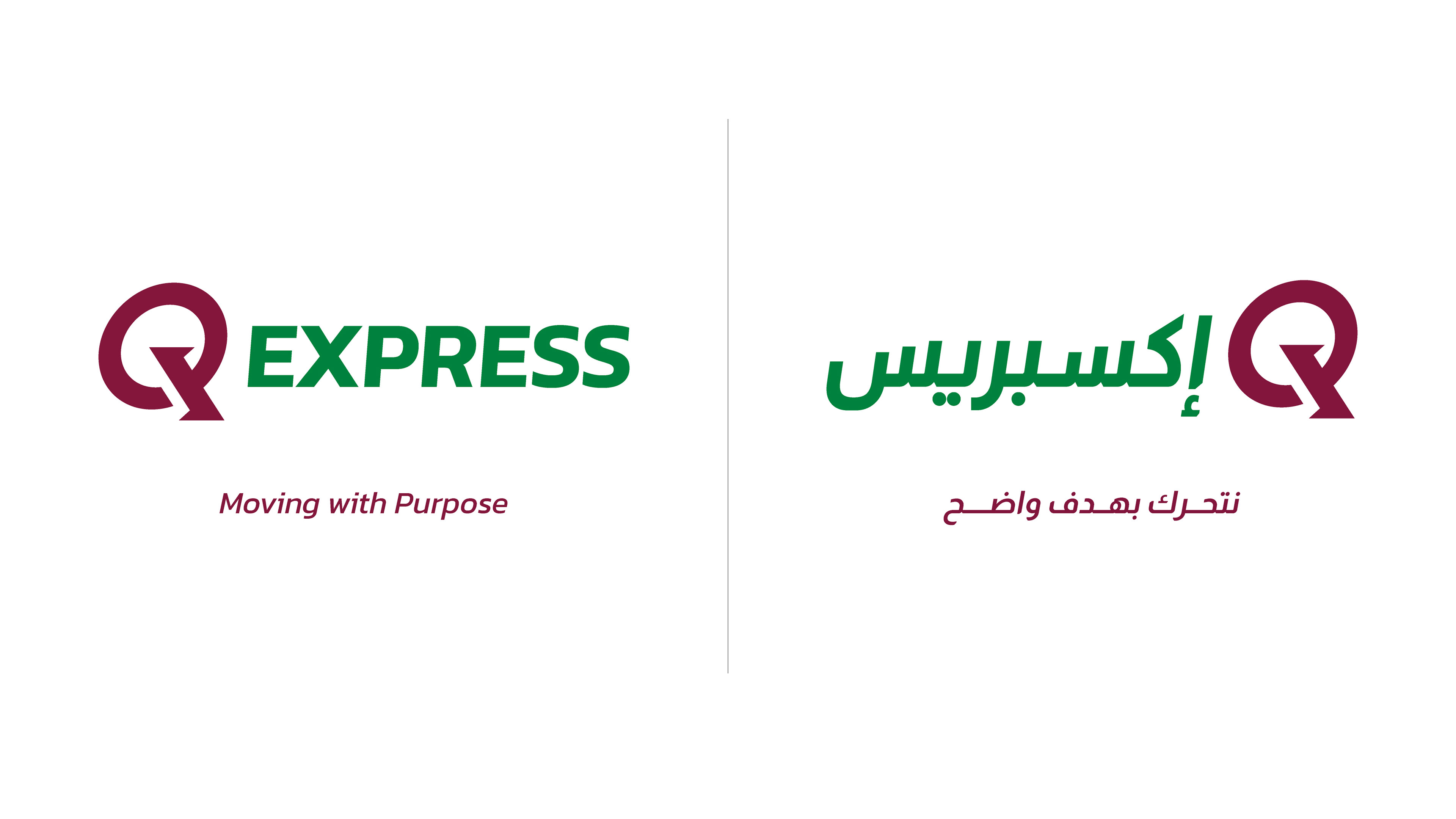
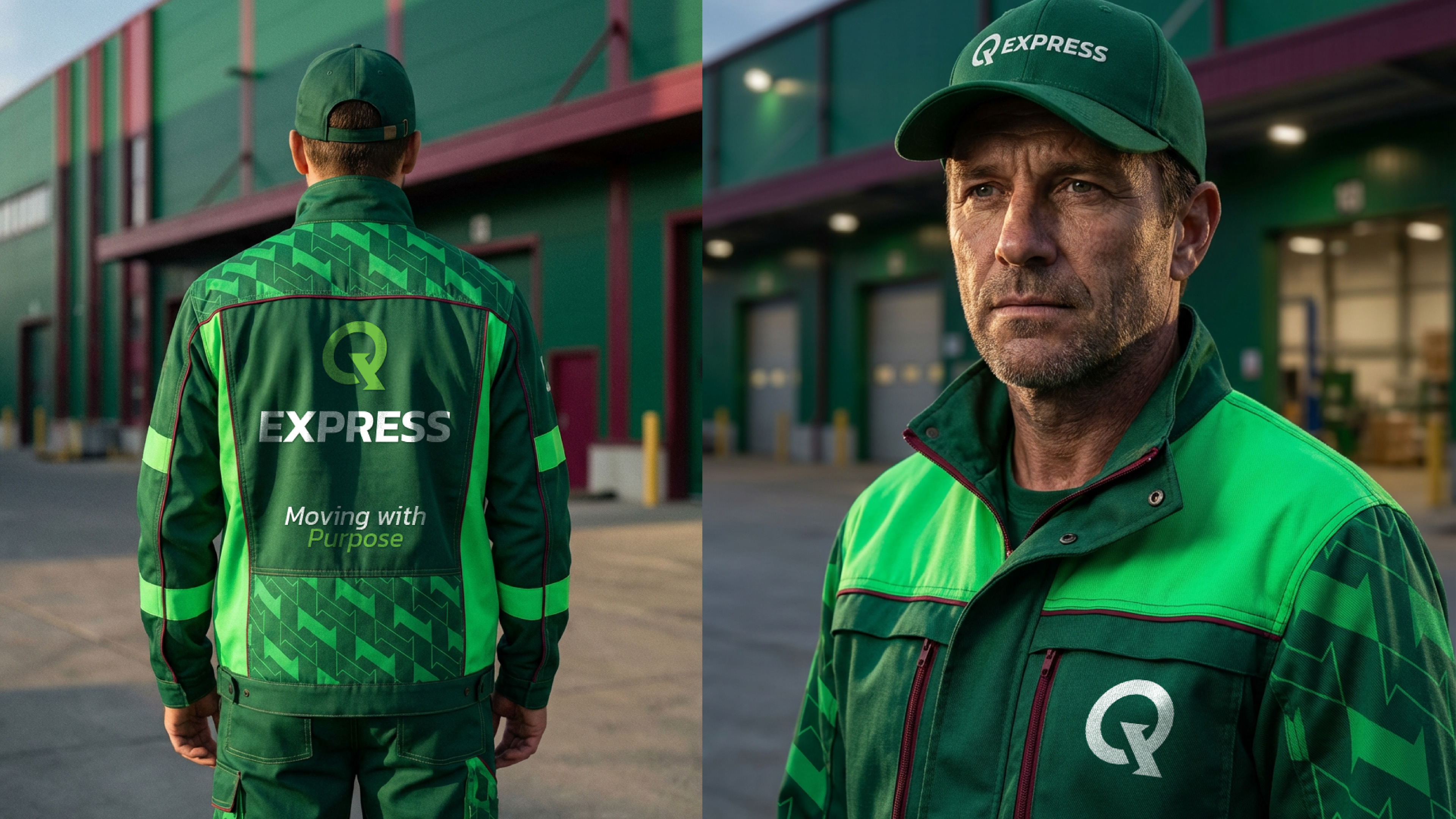
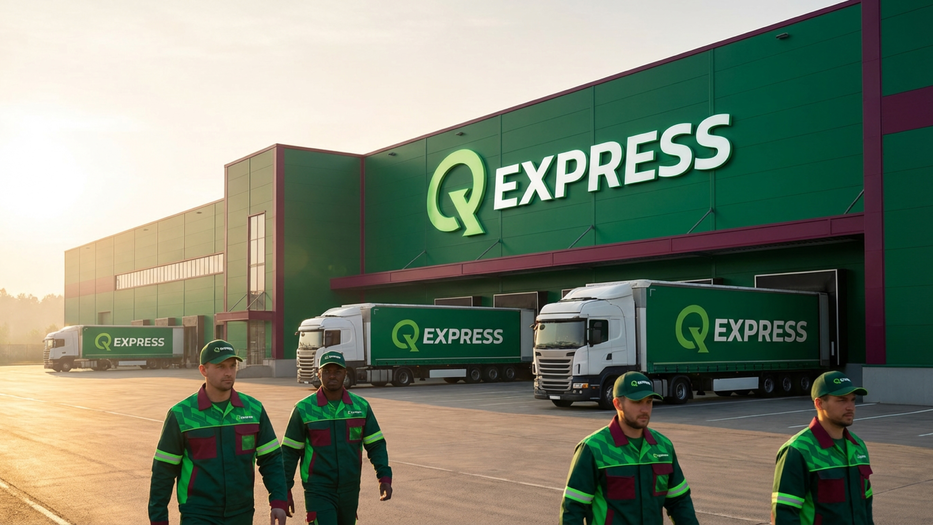
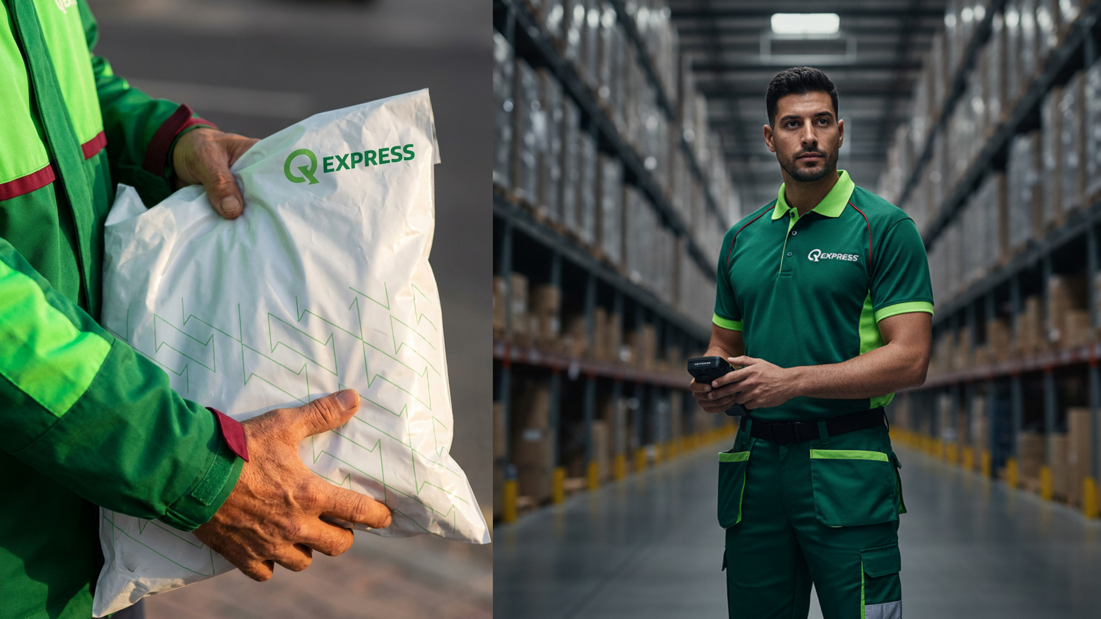
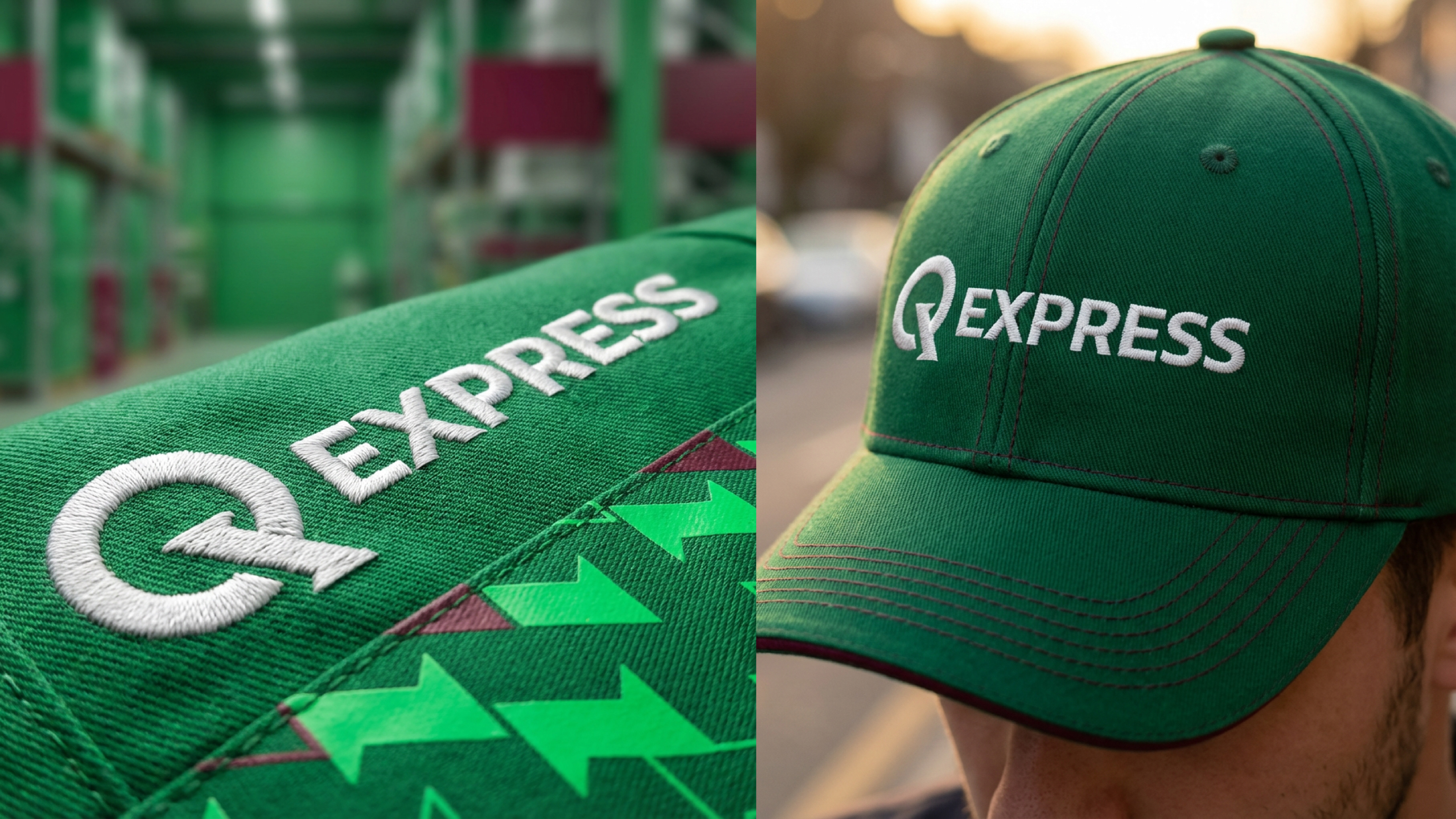
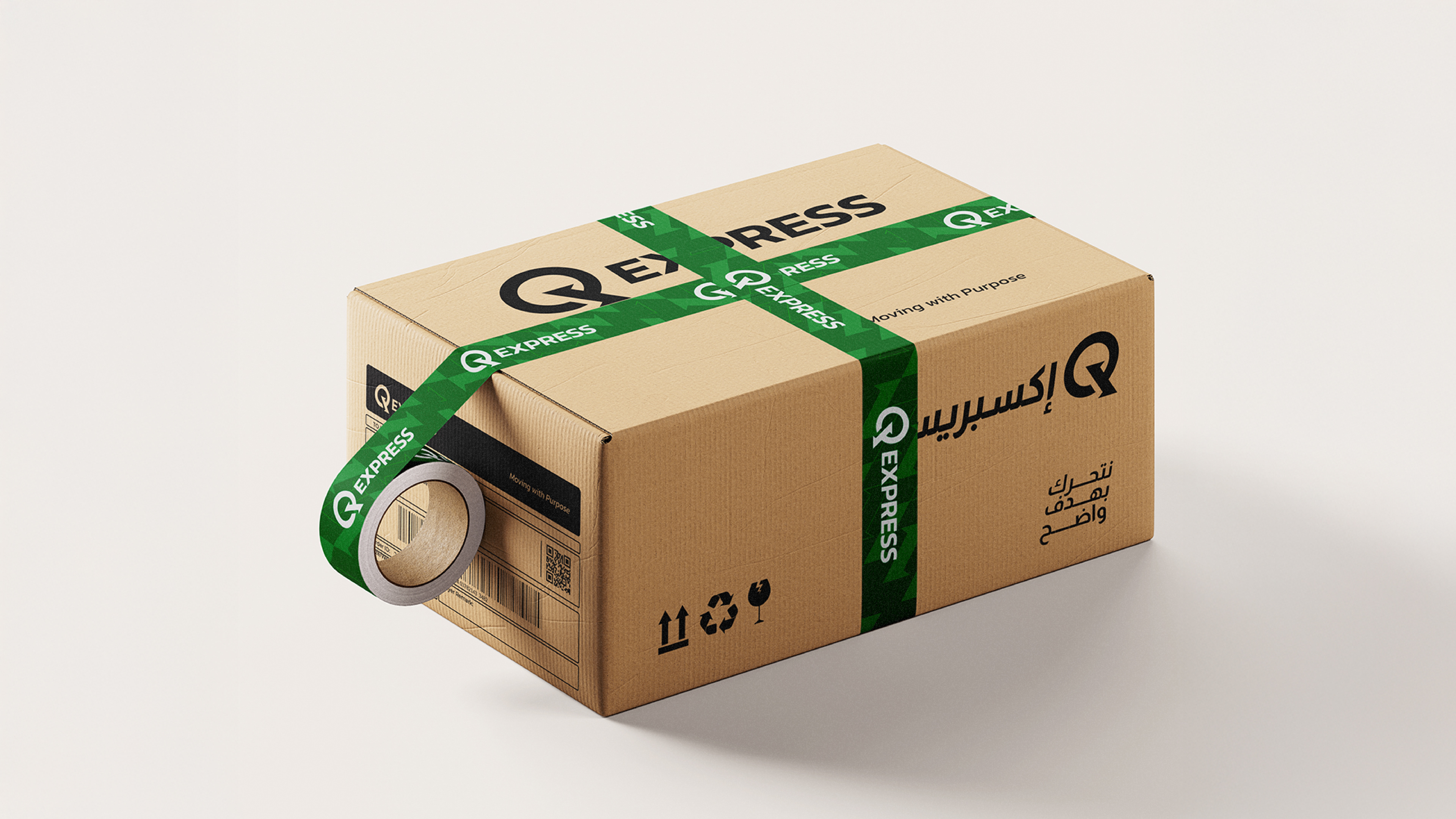
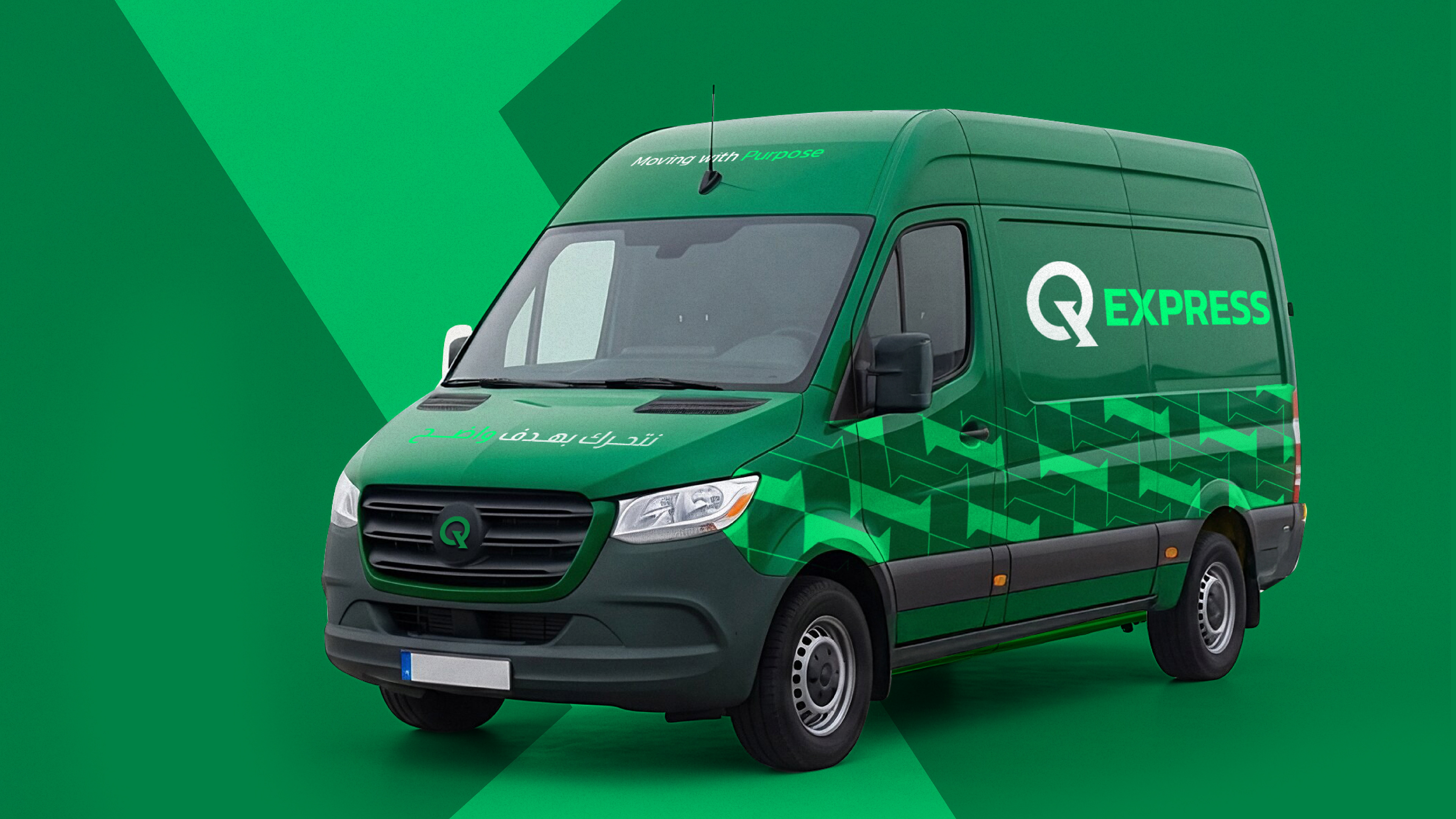
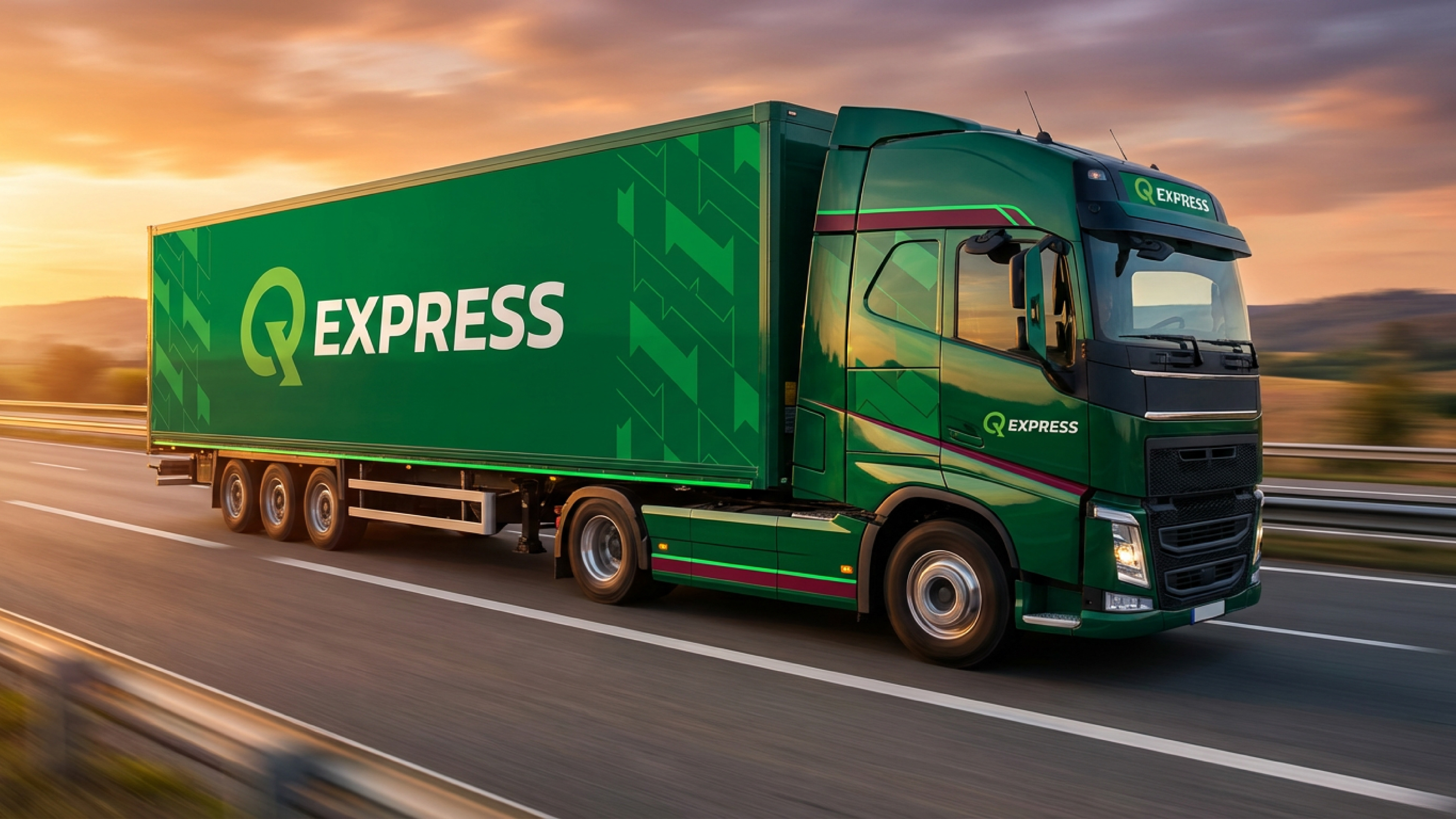
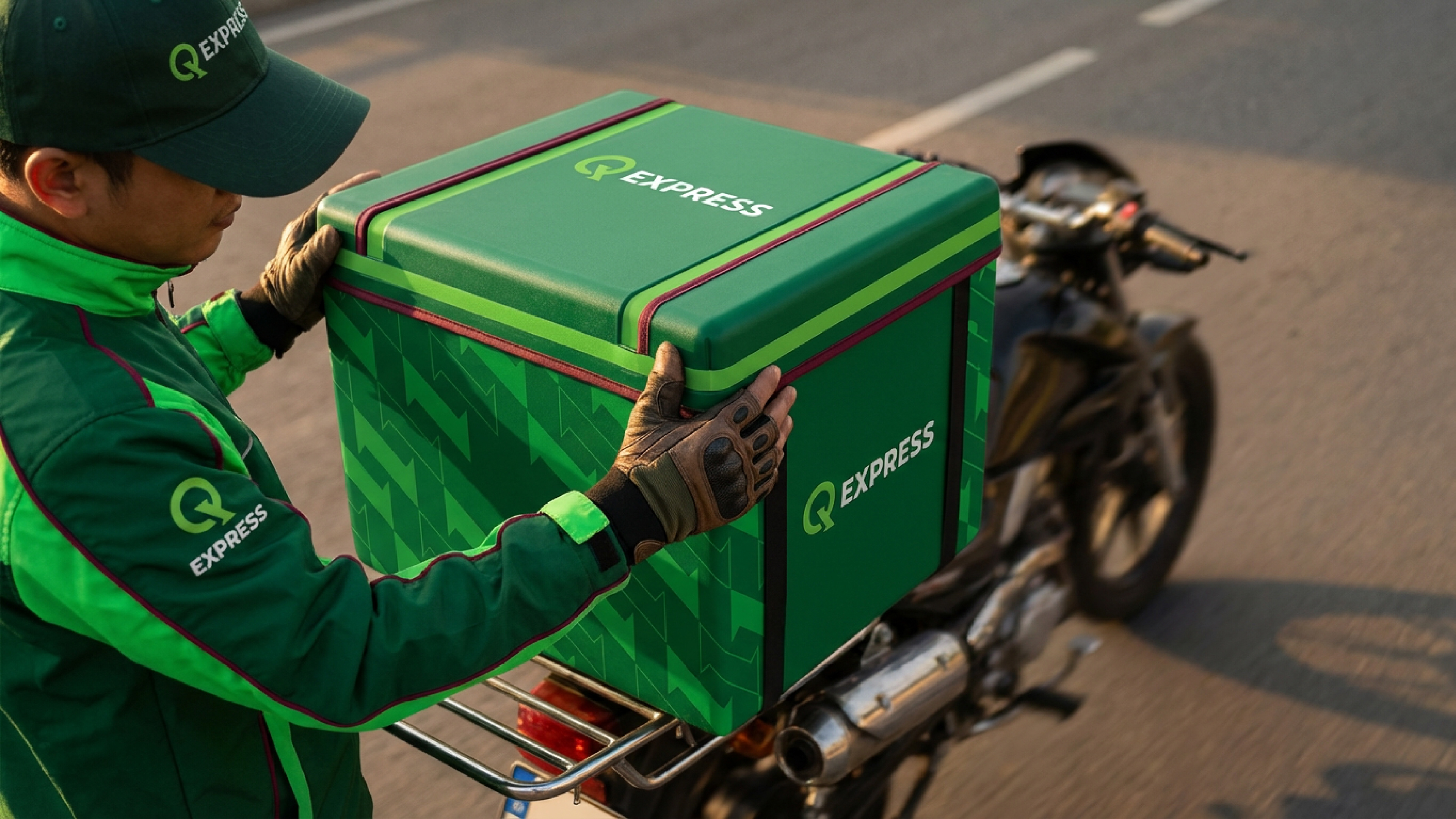
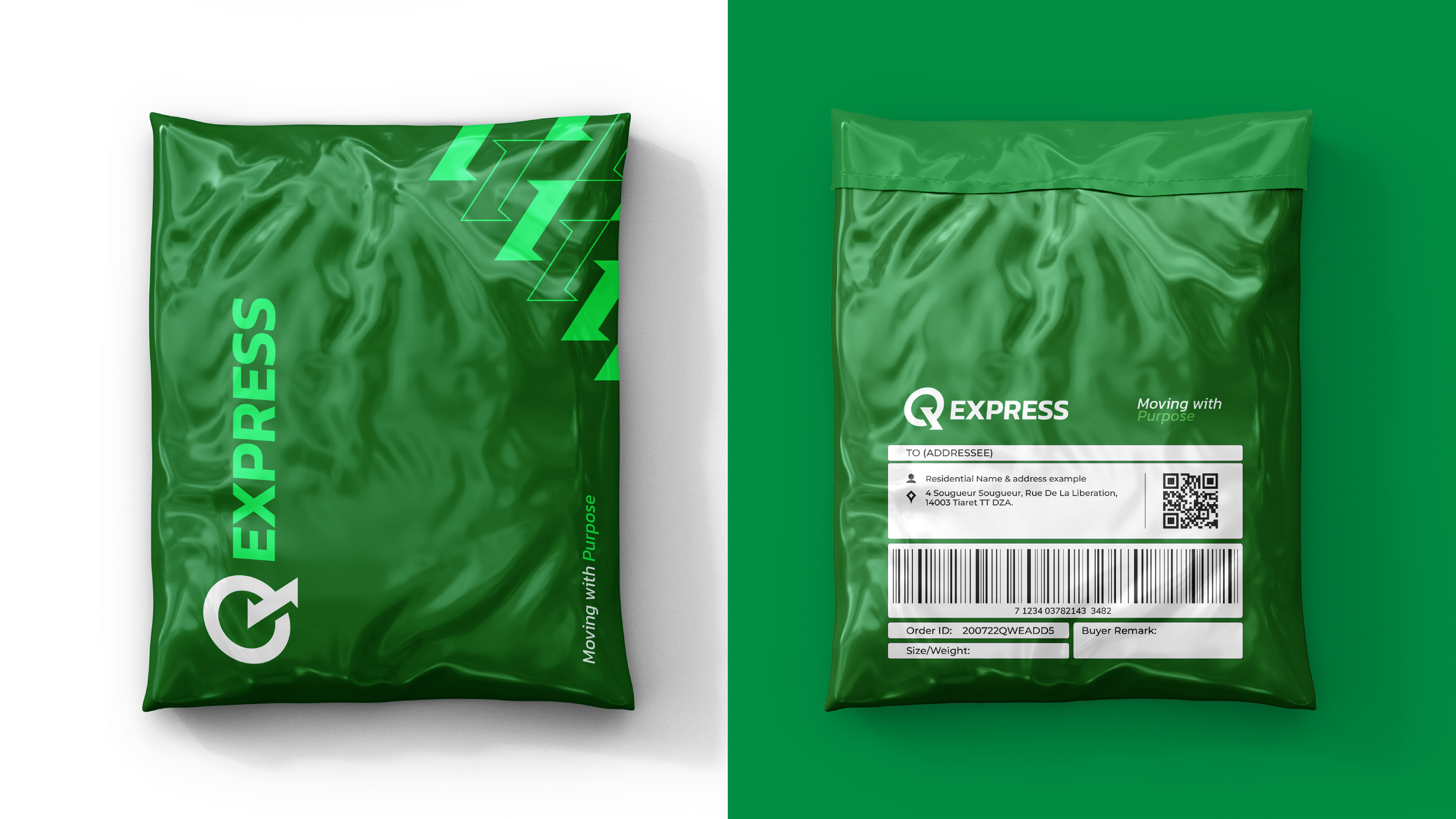
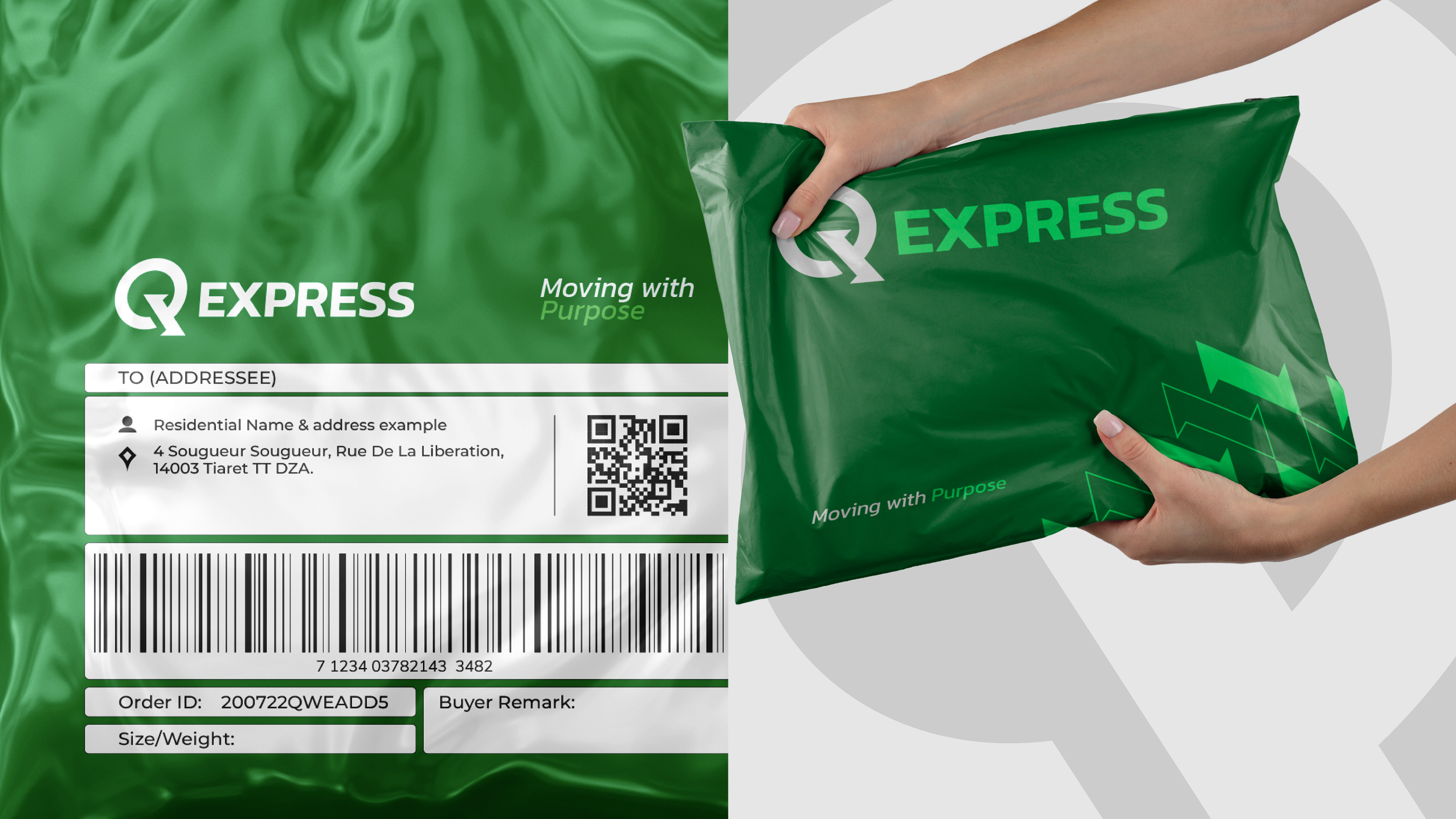
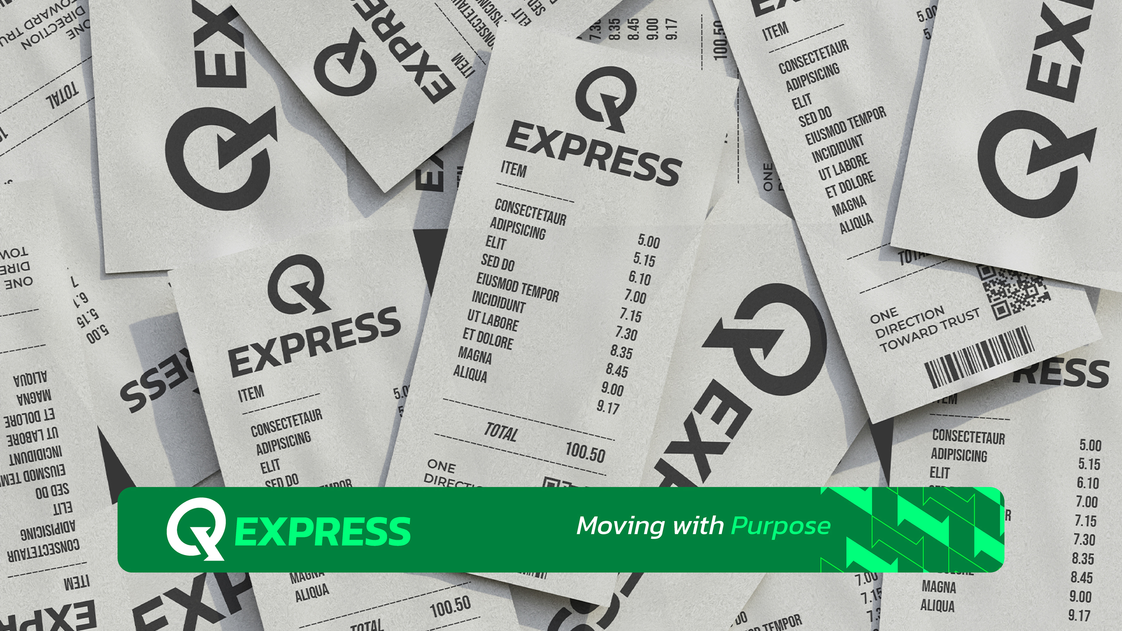
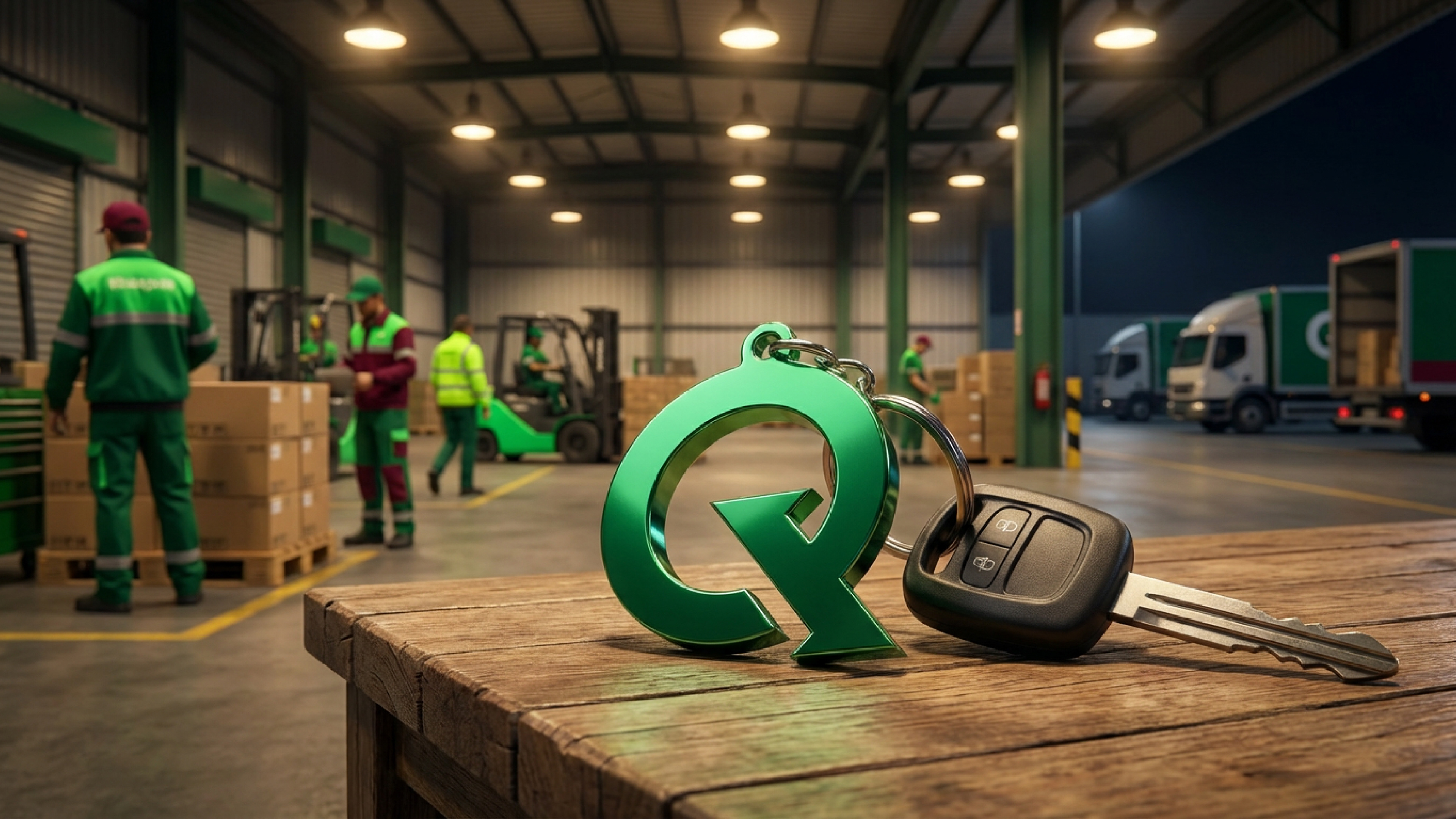
A full identity built for a shipping and delivery company, named after its founder, "Qasioun." The logo shapes the letter "Q" integrated with two directional arrows — one incoming and one outgoing — symbolizing seamless movement, continuous flow, and the promise that every parcel reaches its destination safely and on time. The identity was extended across the company's full range of touchpoints: stationery, parcel bags and boxes, staff uniforms, vehicles, and warehouse signage.