Spin
Client: Spin · Industry: Fast-Casual Egyptian Street Food (Shawarma, Kofta, Hawawshi) · Scope: Full Branding & Packaging
Client: Spin · Industry: Fast-Casual Egyptian Street Food (Shawarma, Kofta, Hawawshi) · Scope: Full Branding & Packaging
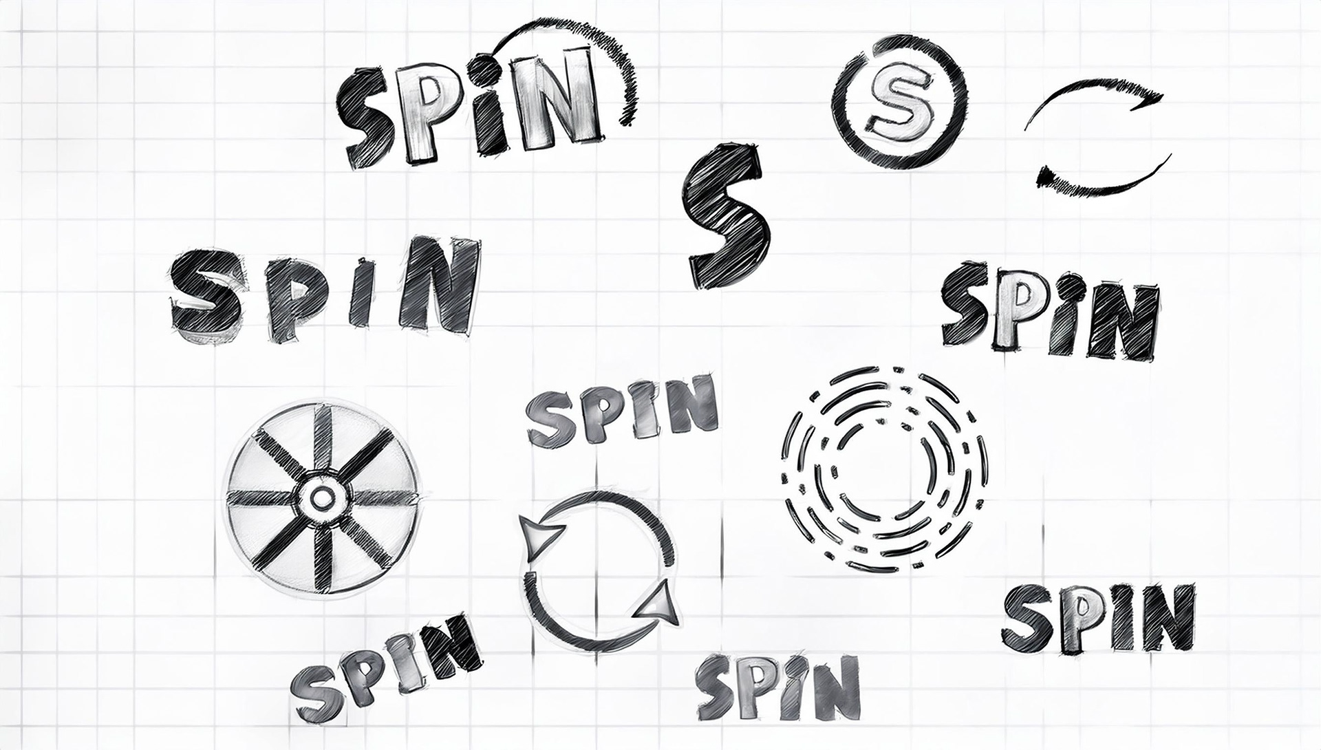
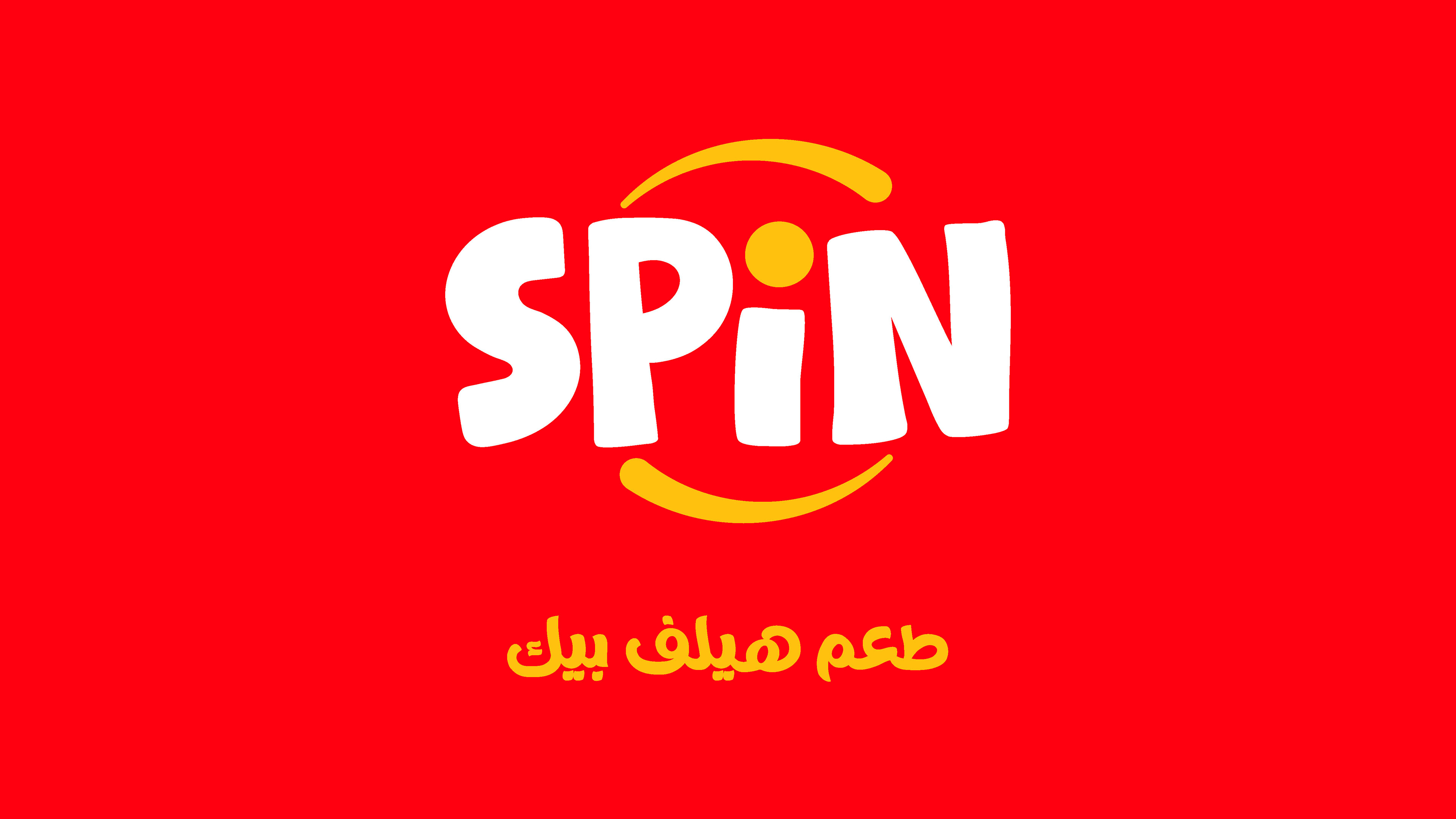
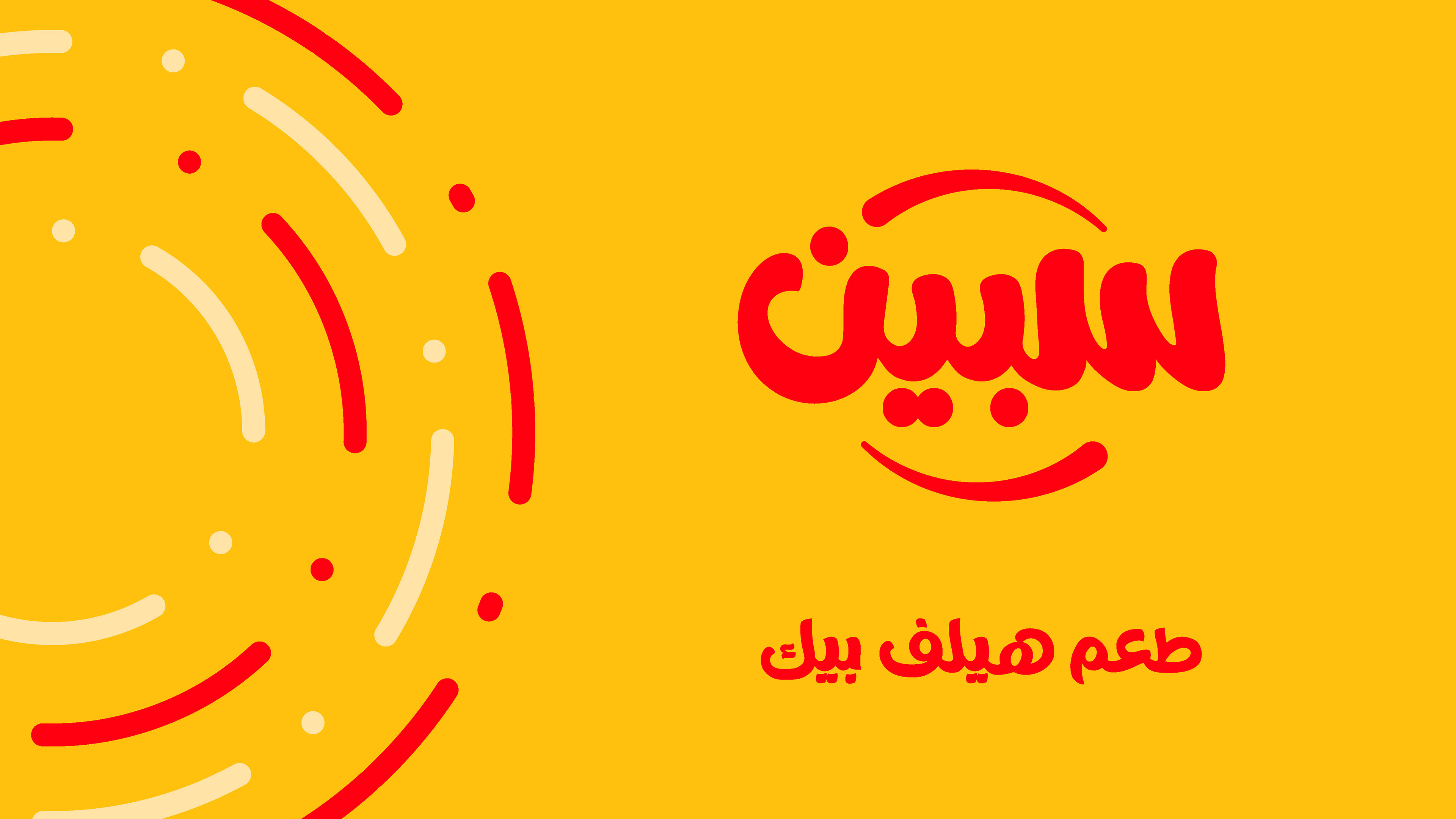
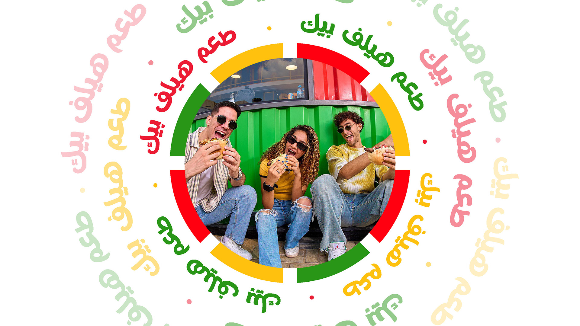
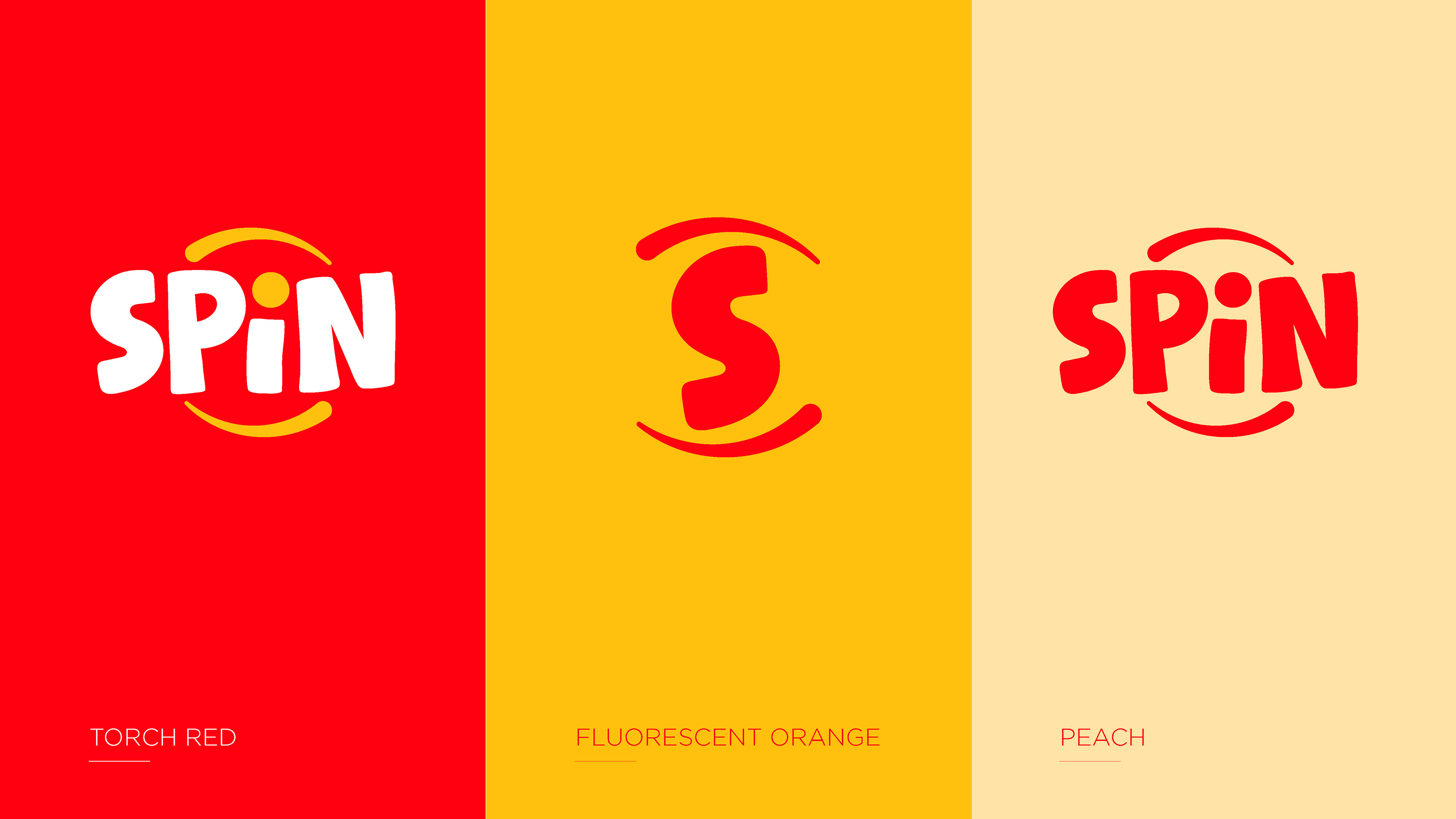
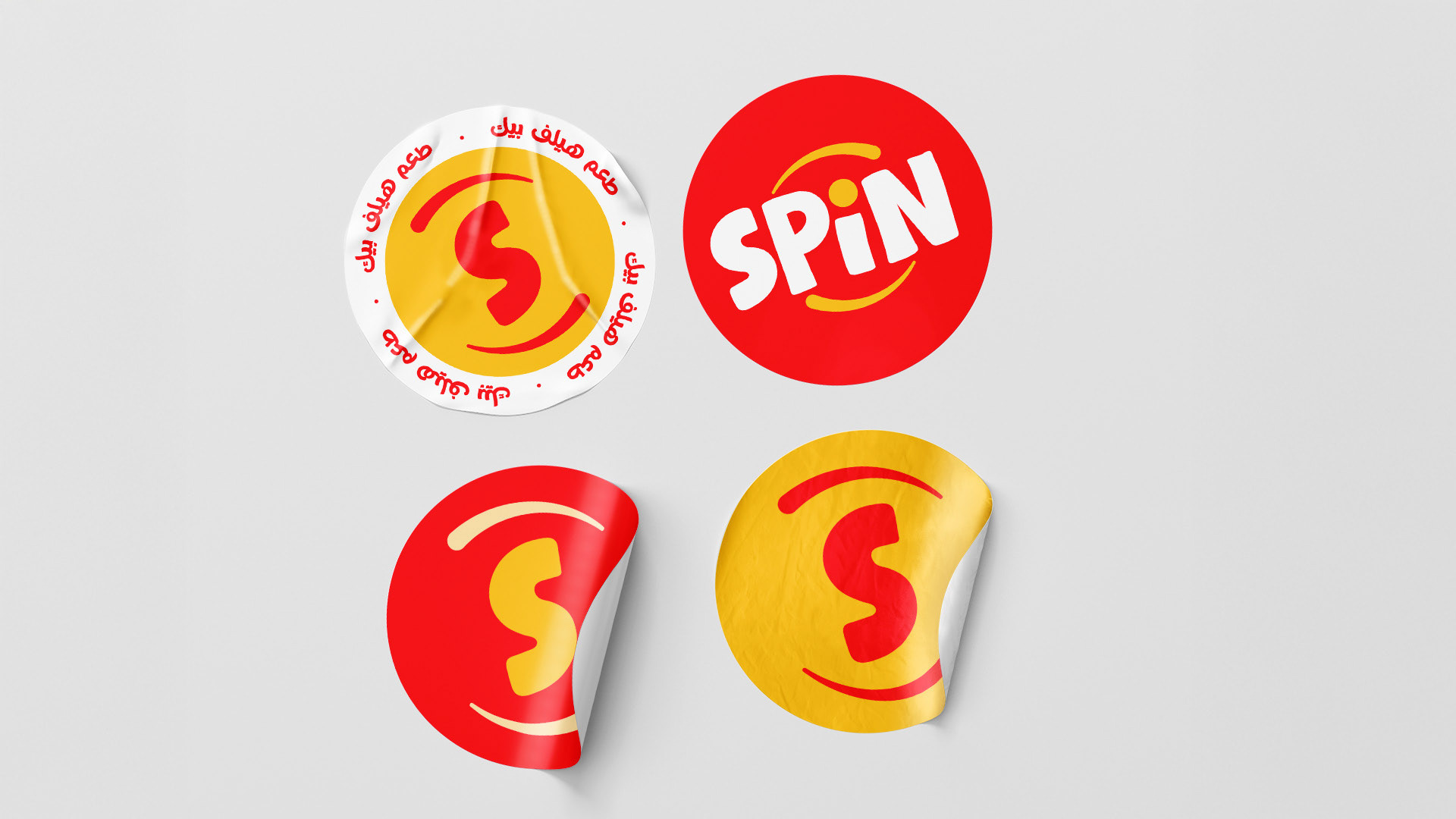
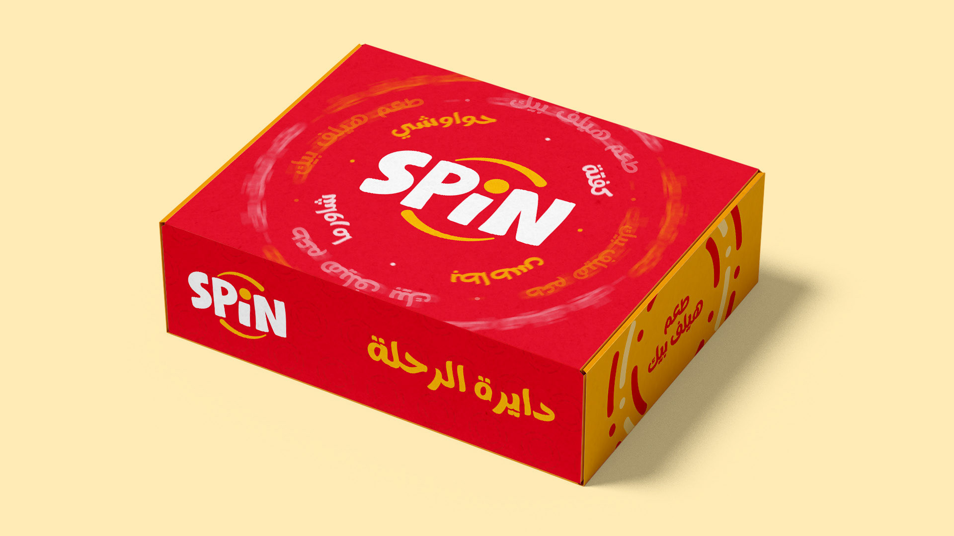
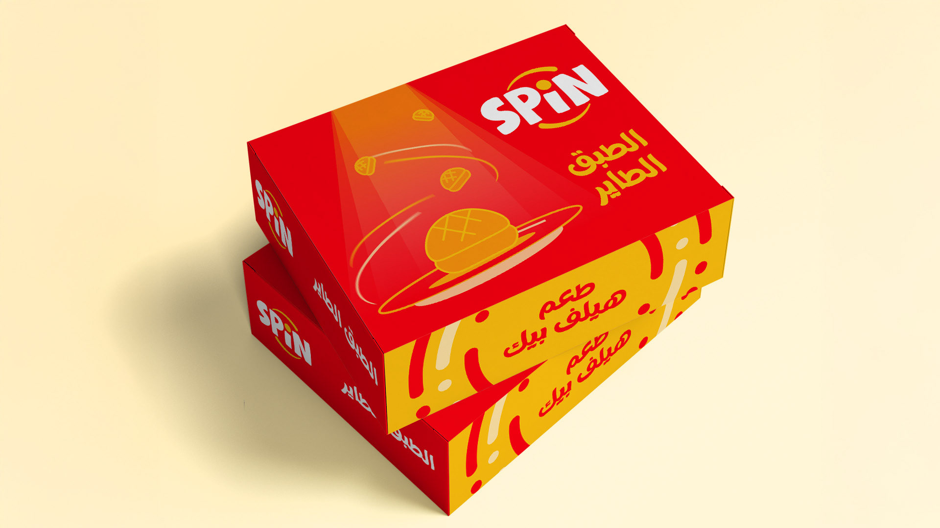
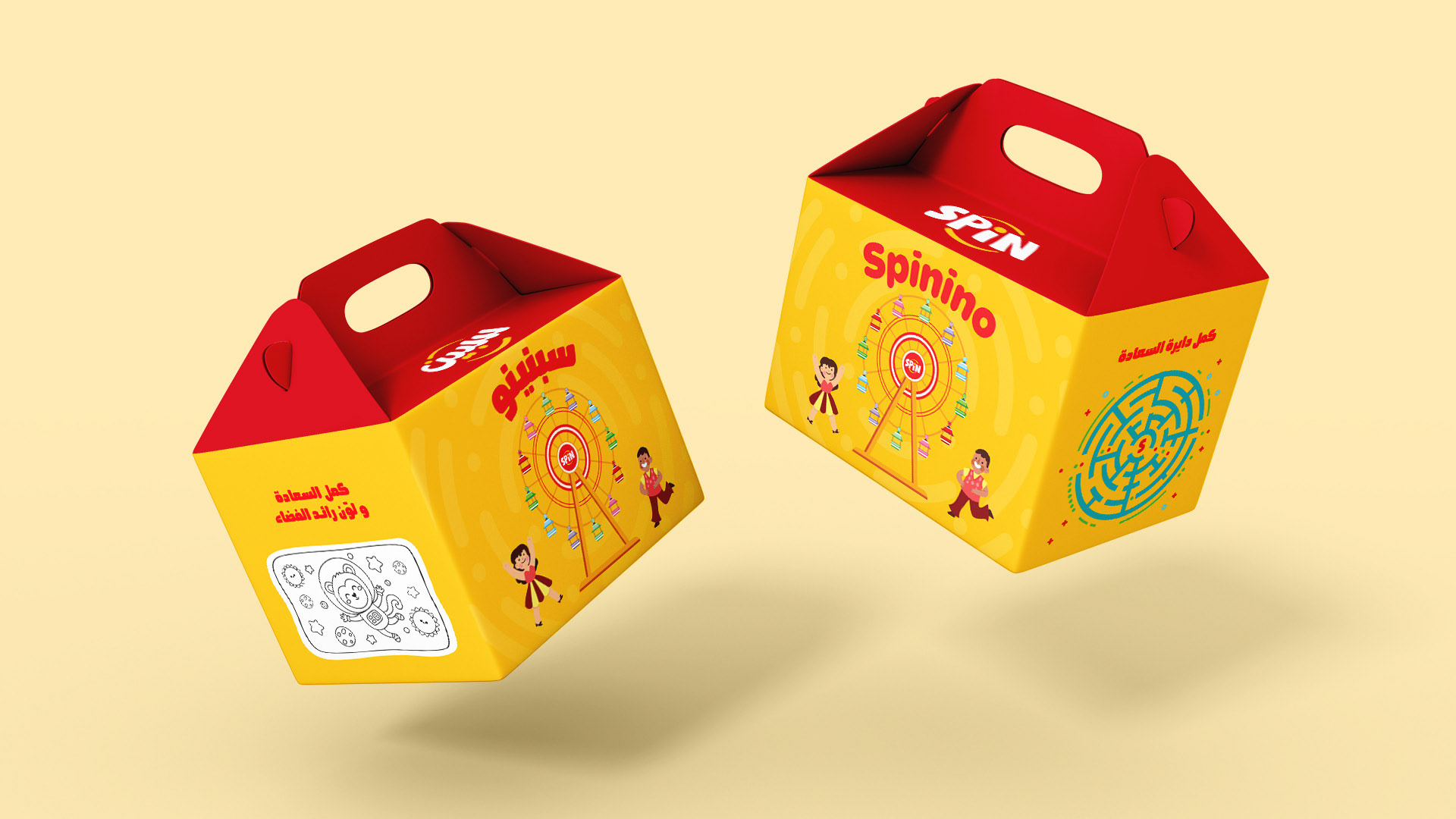
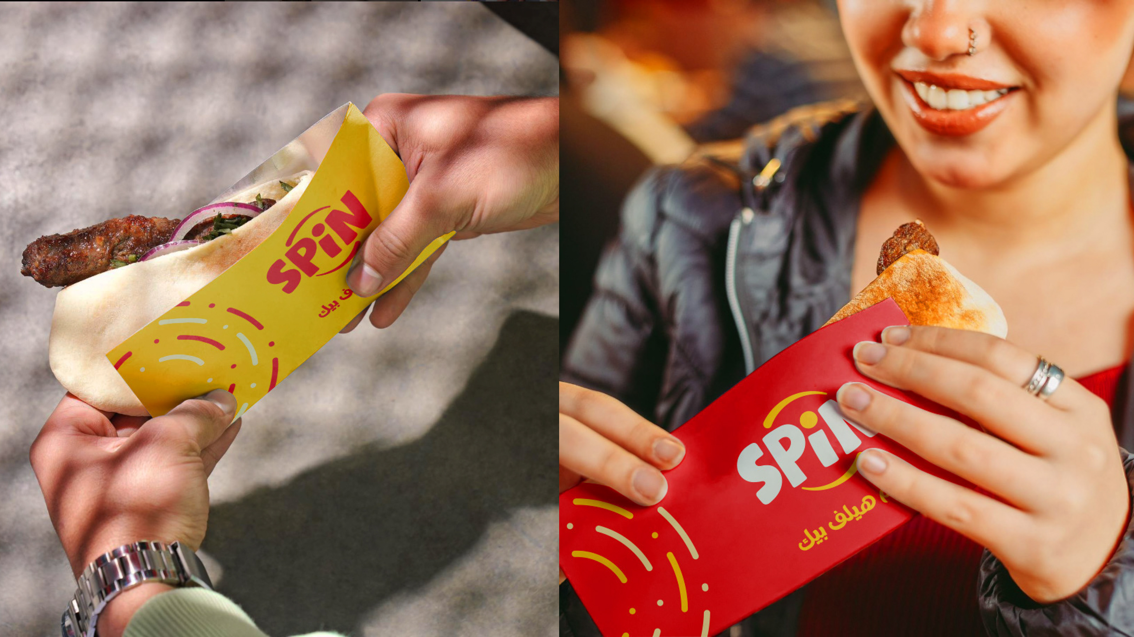
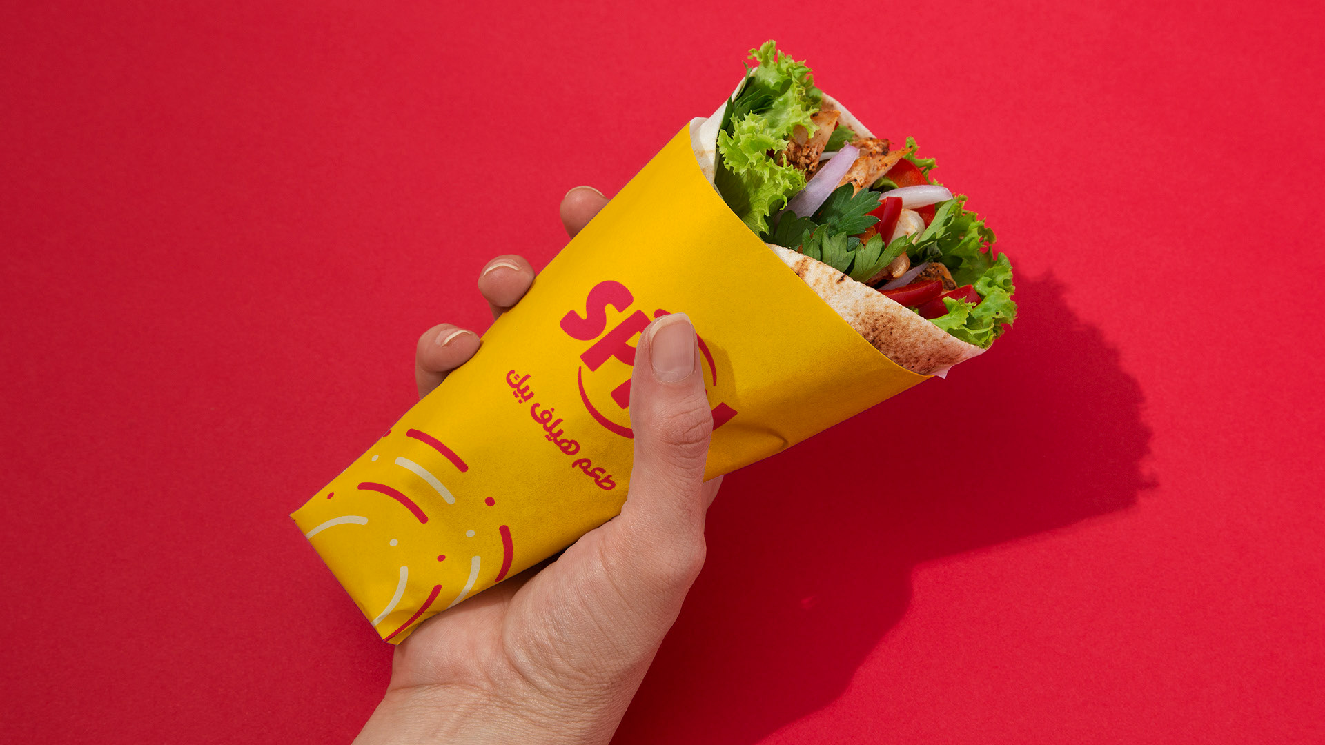
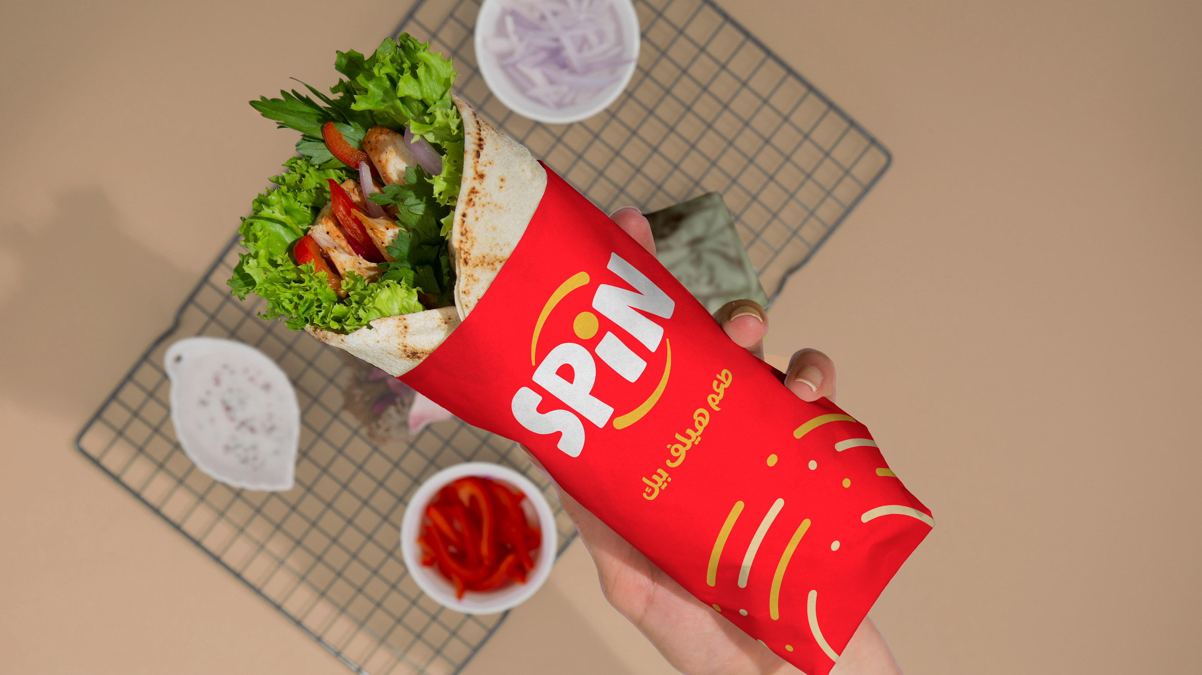
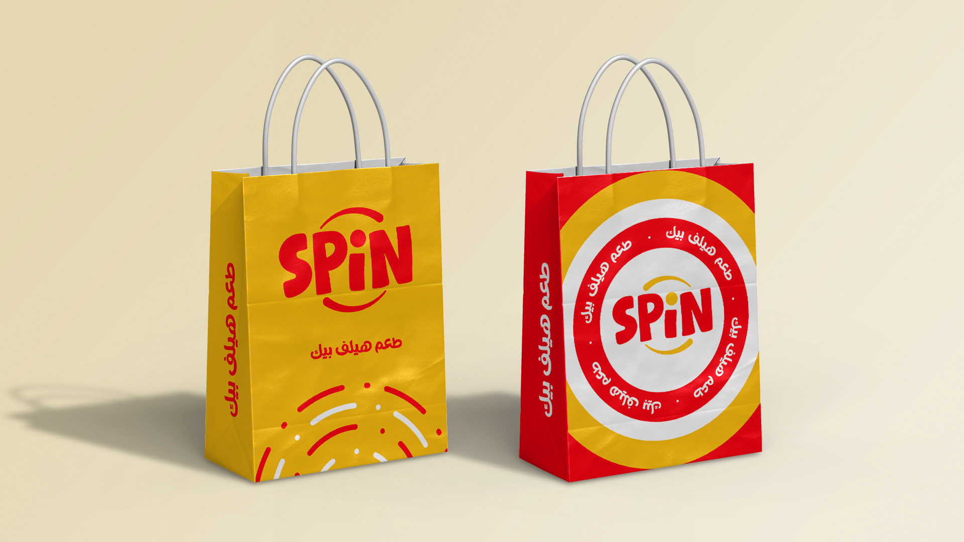
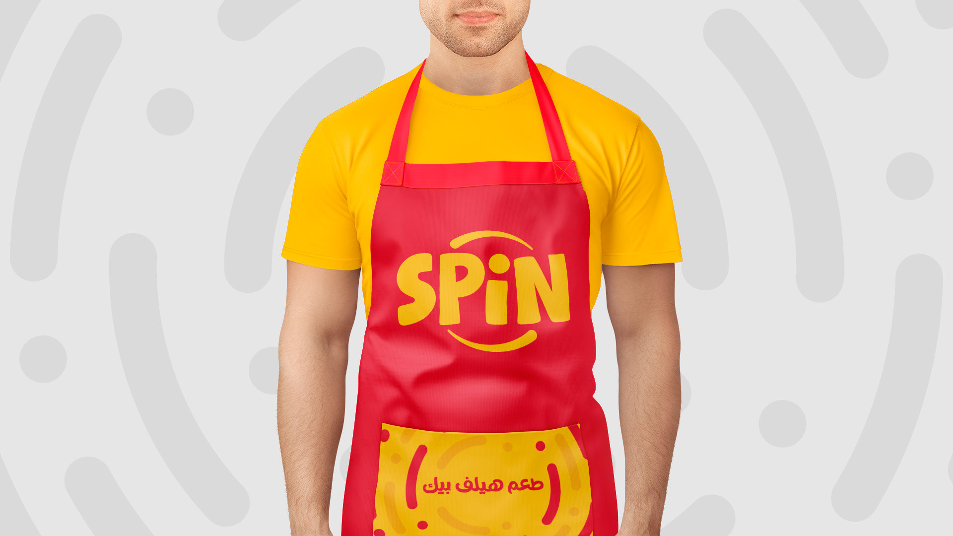
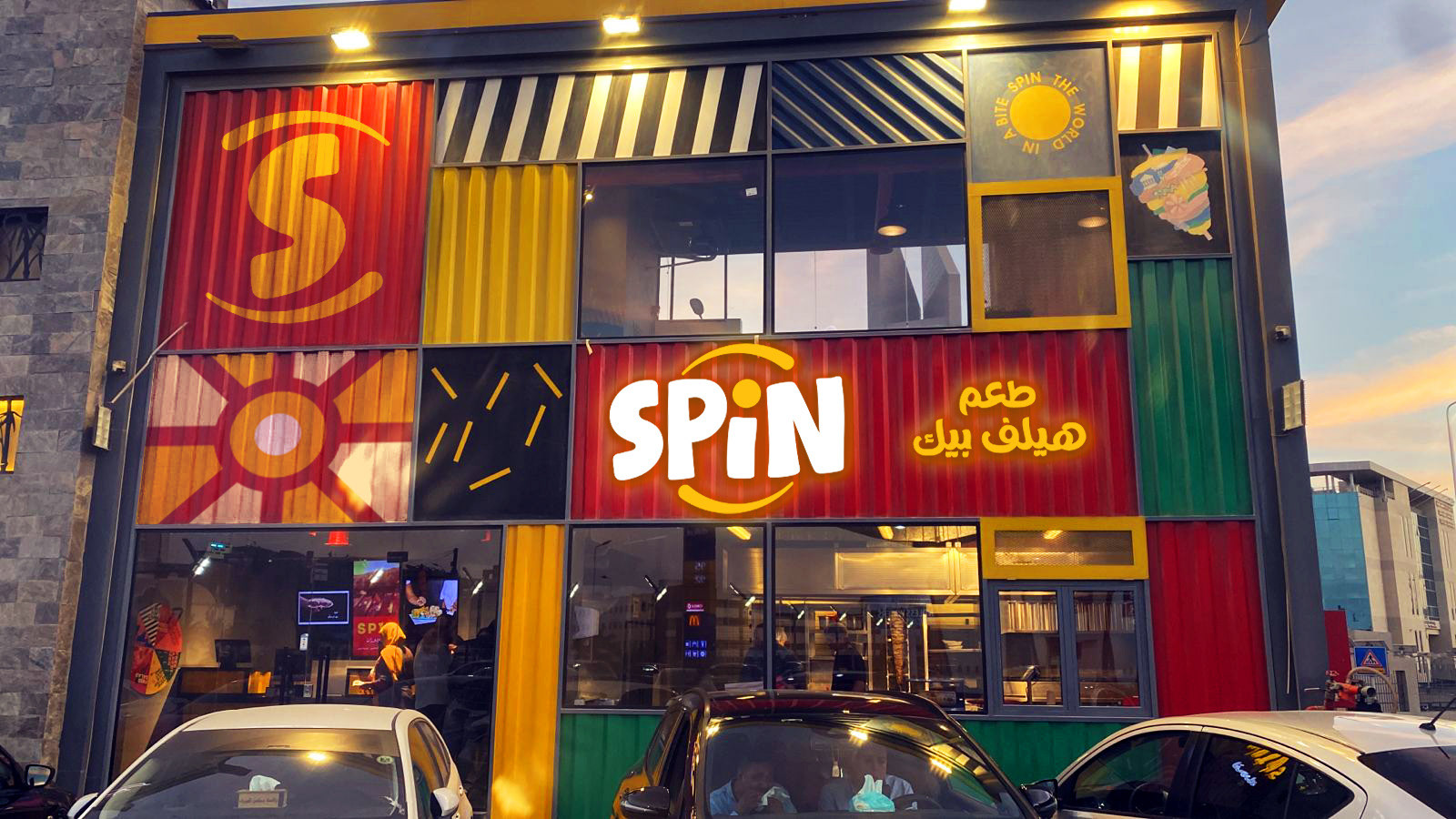
A brand built around motion, tying directly to the name "Spin." The logo uses rounded, bouncy letterforms with a dot over the "I" pulled slightly off-axis and framed in a circular arc — a subtle spinning cue rather than a literal one. Bold red and yellow carry that same high-energy tone across packaging, boxes, and a storefront built from mixed-material panels (corrugated metal, stripes, sun and motion motifs) in the same palette. The full sign-off line ("In a bite, spin the world") extends the concept from the logo into the space itself.